
European Photography Awards Announces the 2026 Photographers and Ca...
AUGUST 14, 2026
Staying at home during this pandemic must be frustrating for all of us, and what's there to do besides, well, having a good glass of wine to spend the day away?
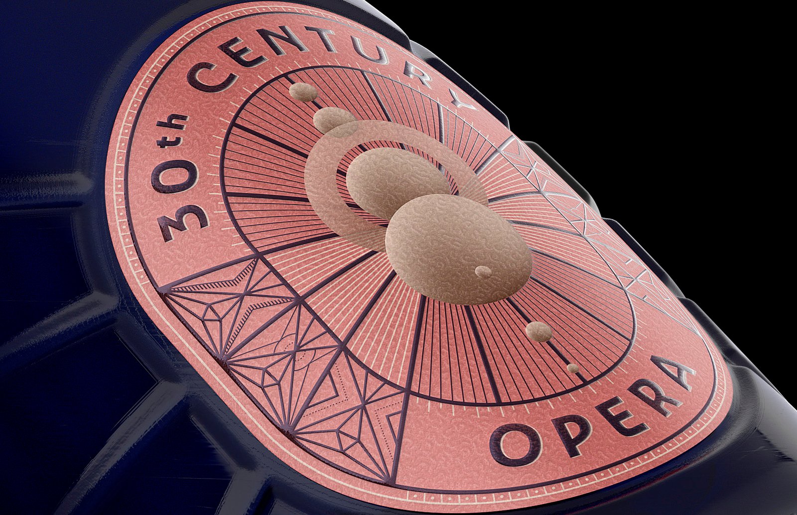
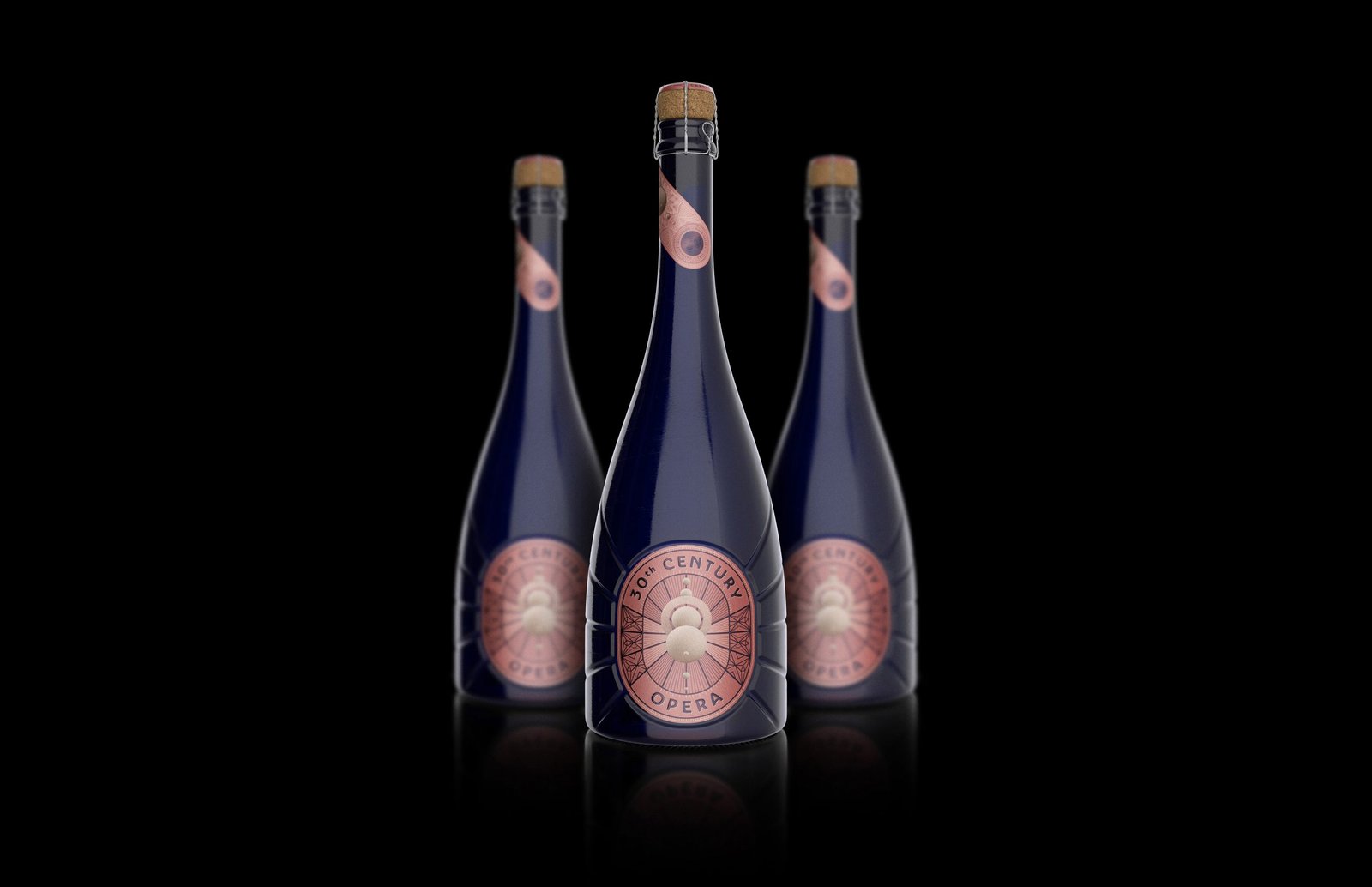
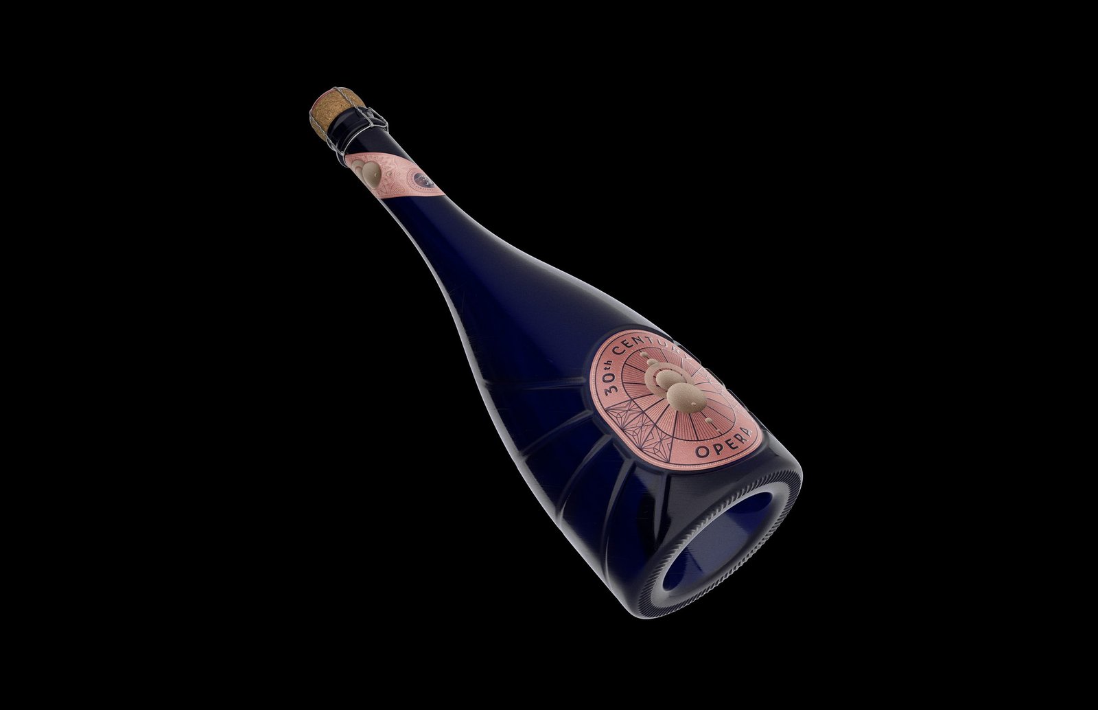
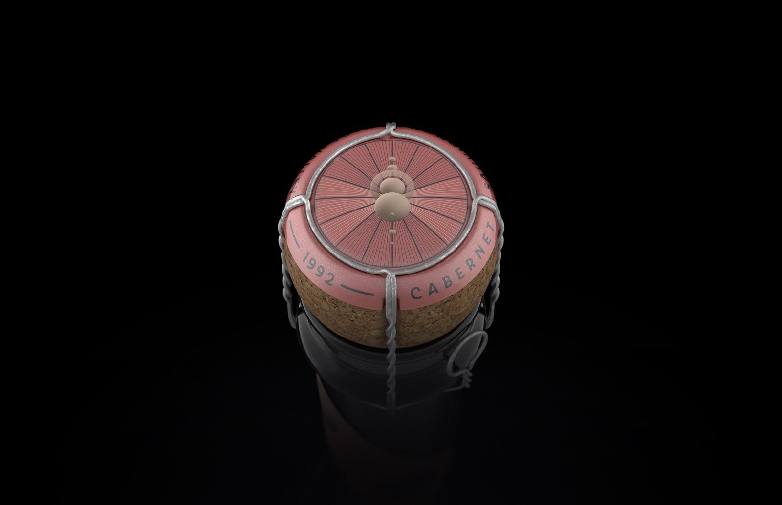
Well, look no further than 30th Century Opera Wine! Before you even taste the wine, come savor the design first:
Designed to maximize the tasting experience by all the wine connoisseurs, the packaging takes us the transcendence of operas to its imaginary limits.
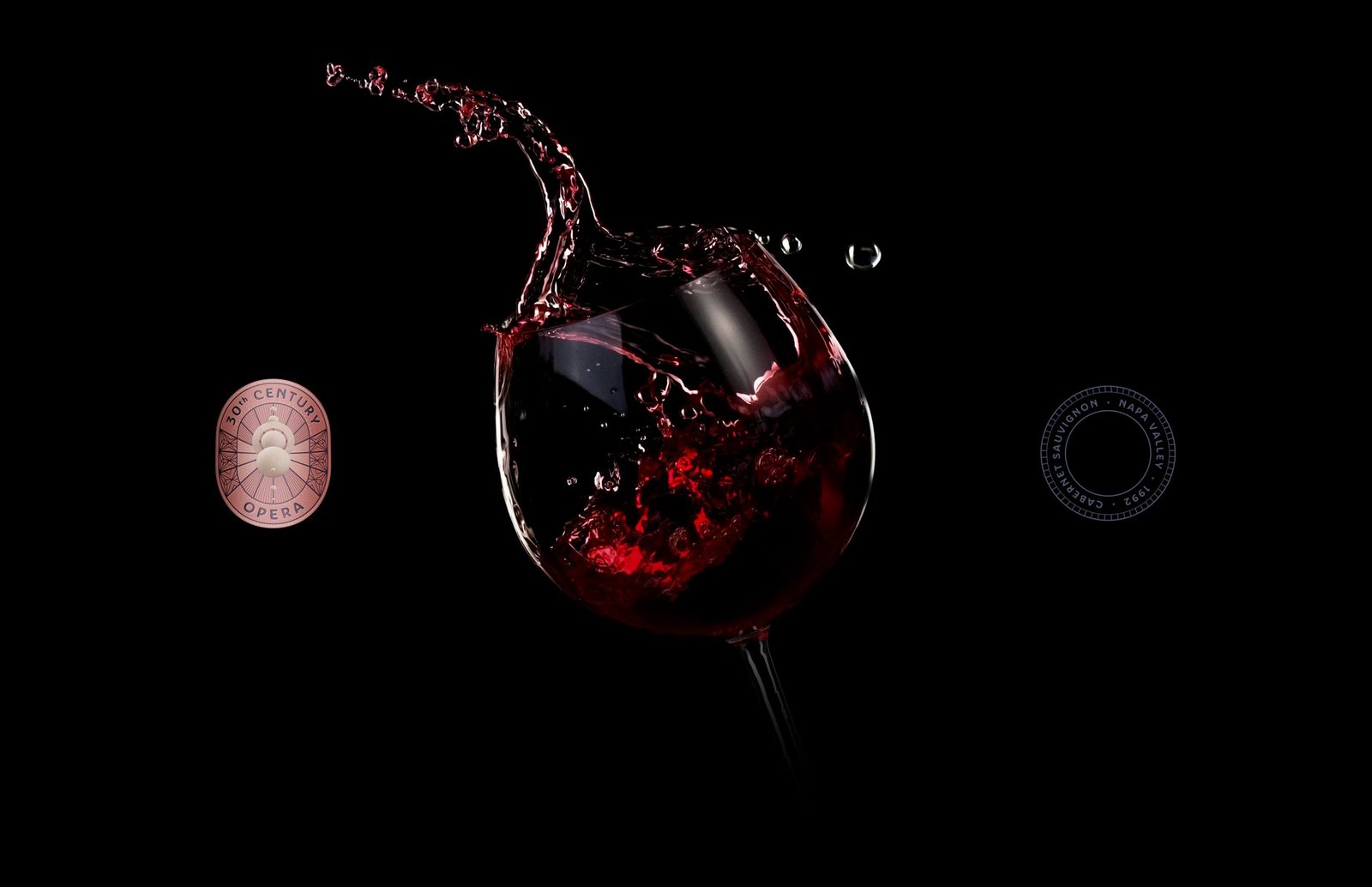
The wine begins with a fruity note that becomes more floral before finishing with oak-aged notes and textured with tannin.
Great design for a bottle of wine, right? Now, take a sip, rewind, and come bask into the perfect glass of red with one of the best packaging designs for a wine in the market!
Entry Title: 30th Century Opera Wine
Entrant Company: C.Carbon Studio
Client: 30th Century Winery Co.
Interested in packaging designs like this? Check out our article about 4 best packaging designs today!