European Photography Awards Announces the 2026 Photographers and Ca...
AUGUST 14, 2026
Sponsored by the International Awards Associate (IAA)
Corporate identity is no longer being employed by the bigwigs in the industry like Apple or Nike, but by everyone who wishes to stand out and adopt a persona that can be remembered by many.
In this article, you'll see 3 different corporate identity designs that truly embodies the brand/company and increase their universal appeal for all to see. Winning the Platinum Winner at the 2020 MUSE Creative Awards, it is no wonder these designs are truly extraordinary and unique on its own.
Interested already? Come check them out here:
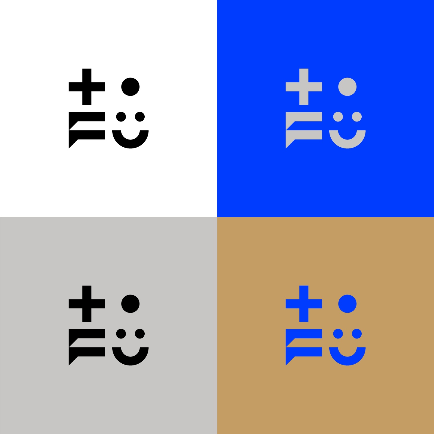
Based in Poland, the creative agency TOFU Studio's new logo and branding is a combination of two elements - creative imagination and real craftsmanship that decodes the philosophy of their relationships and working process on each project.
The design is represented by sophisticated and restrained typography, and simple, black and white graphic forms with a light technical note. It is definitely one of the most memorable visuals we've seen in MUSE so far!
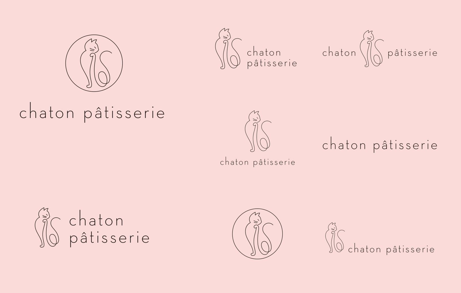
“Chaton” is “kitten” in French, and for this French dessert brand, the owner is a cat owner who wishes to make delicate desserts for everyone, and hopes that whoever tastes the desserts will be totally relieved from stress. Mmm mmm indeed!
By illustrating the posture of a cat licking its paws after tasting the pasty, and pairing the logo with a slim sans-serif typeface, the new brand identity becomes neater and more elegant.
The light pink also gives off an airy, minimalistic look that really gets your attention when you receive a package like this. If you have a chance to taste one of their pastries, do keep the box as well; the box is that good looking!
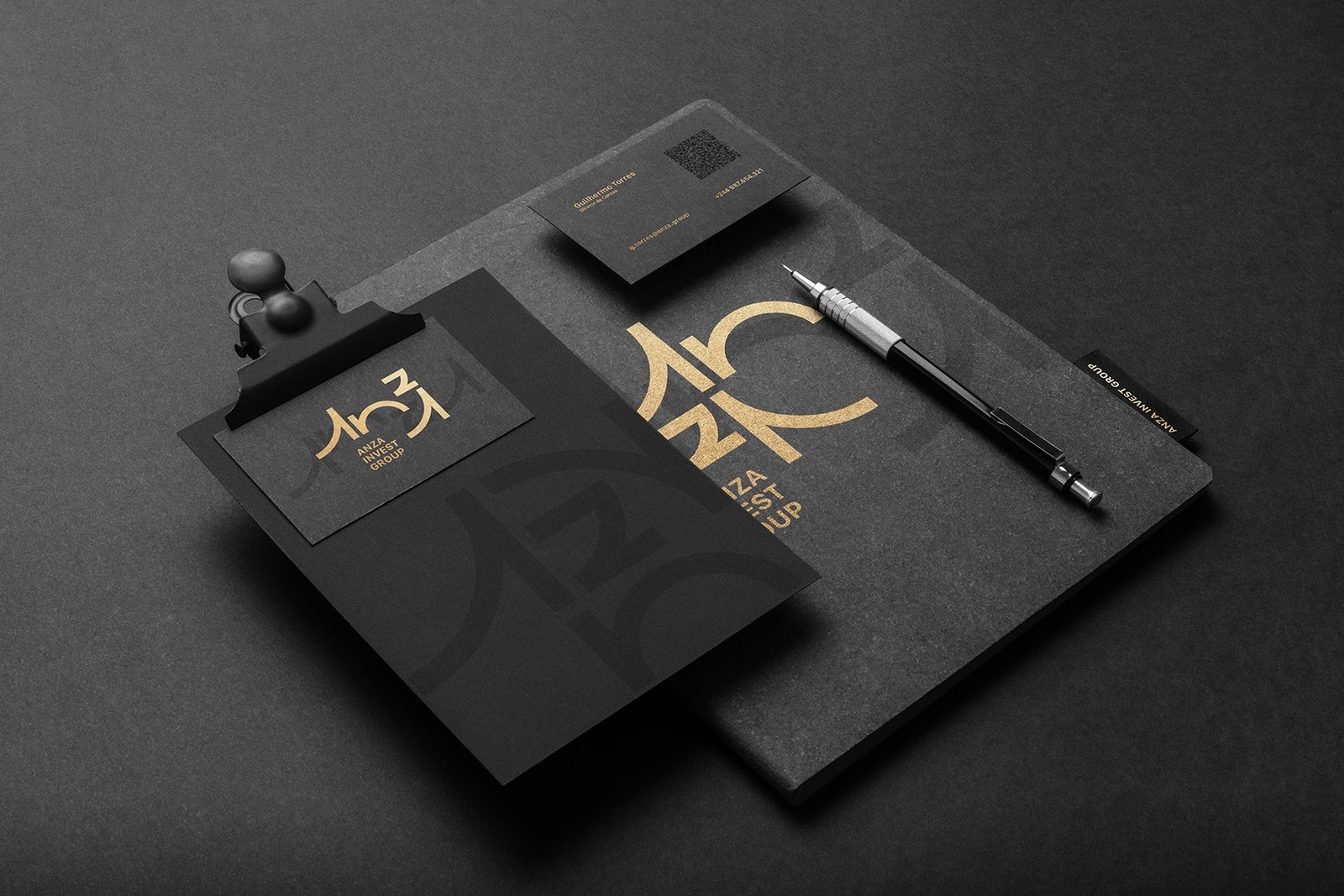
For all the matte black connoisseurs out there, get invested in what could possibly be the suavest looking visuals for a brand we've seen so far.
Given Anza's global presence, the brand concept was created to attribute a universal and timeless aspect to it, with a logo that could be visually friendly to various writing systems, such as Latin, Cyrillic, Hanzi, and Hebrew.
The choice to create a dynamic logo using the visual reading of typography beyond writing allowed the brand to explore this cultural plurality to the fullest, allowing many variations of the logo in several formats. Pretty neat, if you ask me!
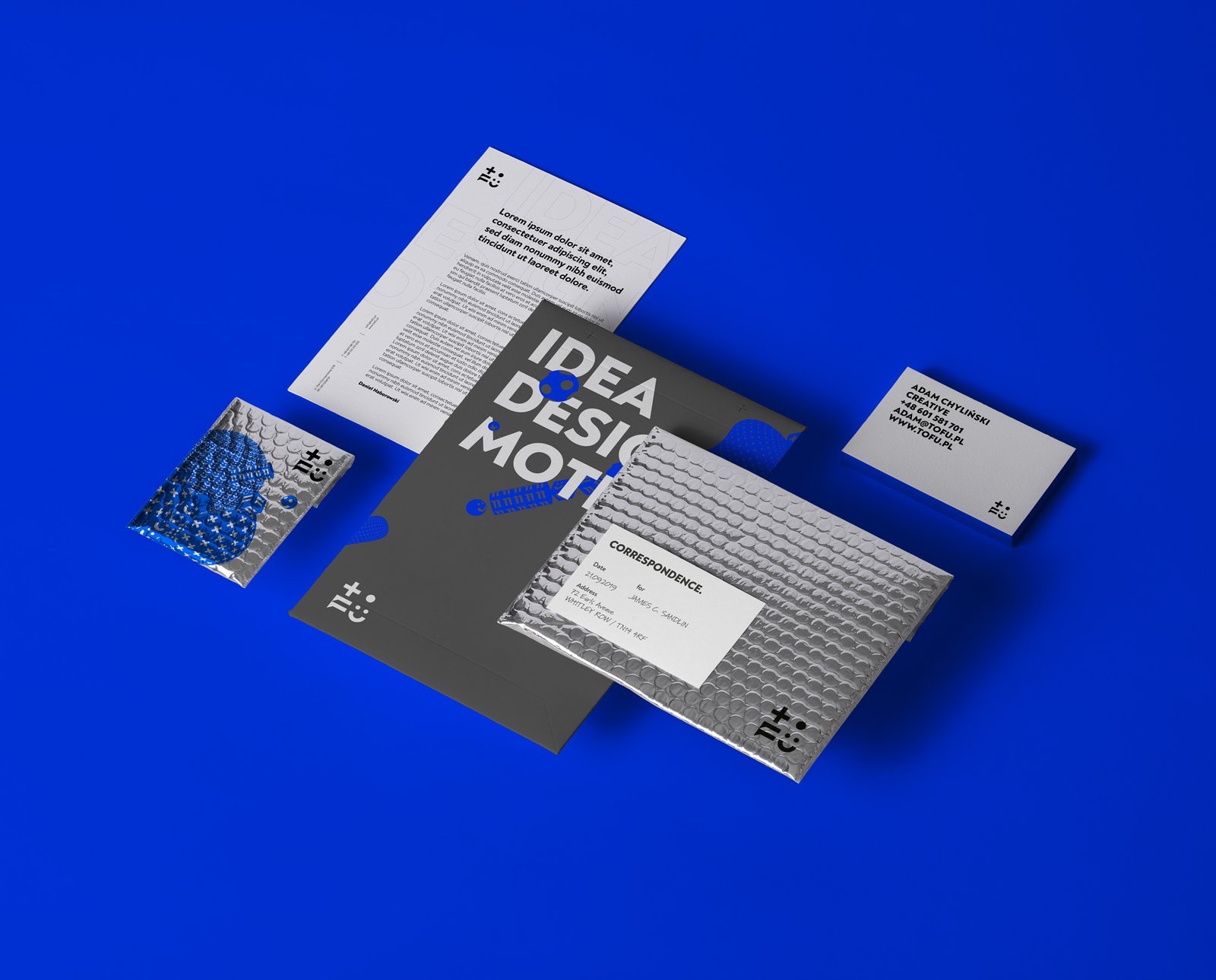
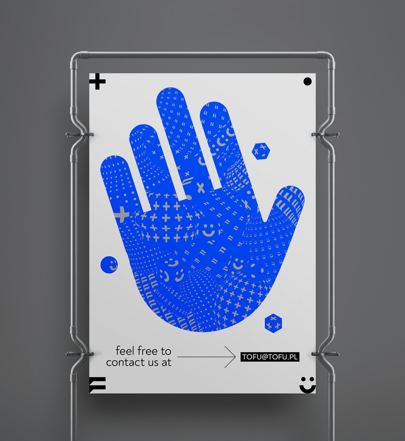
Entry Title: TOFU Studio / branding
Entrant Company: TOFU Studio
Winning Category: Corporate Identity, Logos
Entry Title: Chaton Pâtisserie
Entrant Company: Triangler
Client: Chaton Pâtisserie
Winning Category: Corporate Design, Brand Identity
Entry Title: Anza Invest Group
Entrant Company: Creative Carbon Studio
Client: Socialkorp
Winning Category: Corporate Identity
If you are looking to spice up your brand or create something as elegant or suave like these 3 amazing designs, this is your time to do so!
If you have an amazing design of any kind, do contact me at andy@iaaawards.com, and we will definitely come up with some amazing ways to showcase your ideas!