Safe S3X 4U
Safe S3X 4U is a self-initiated brand identity system designed to change how sexual health...
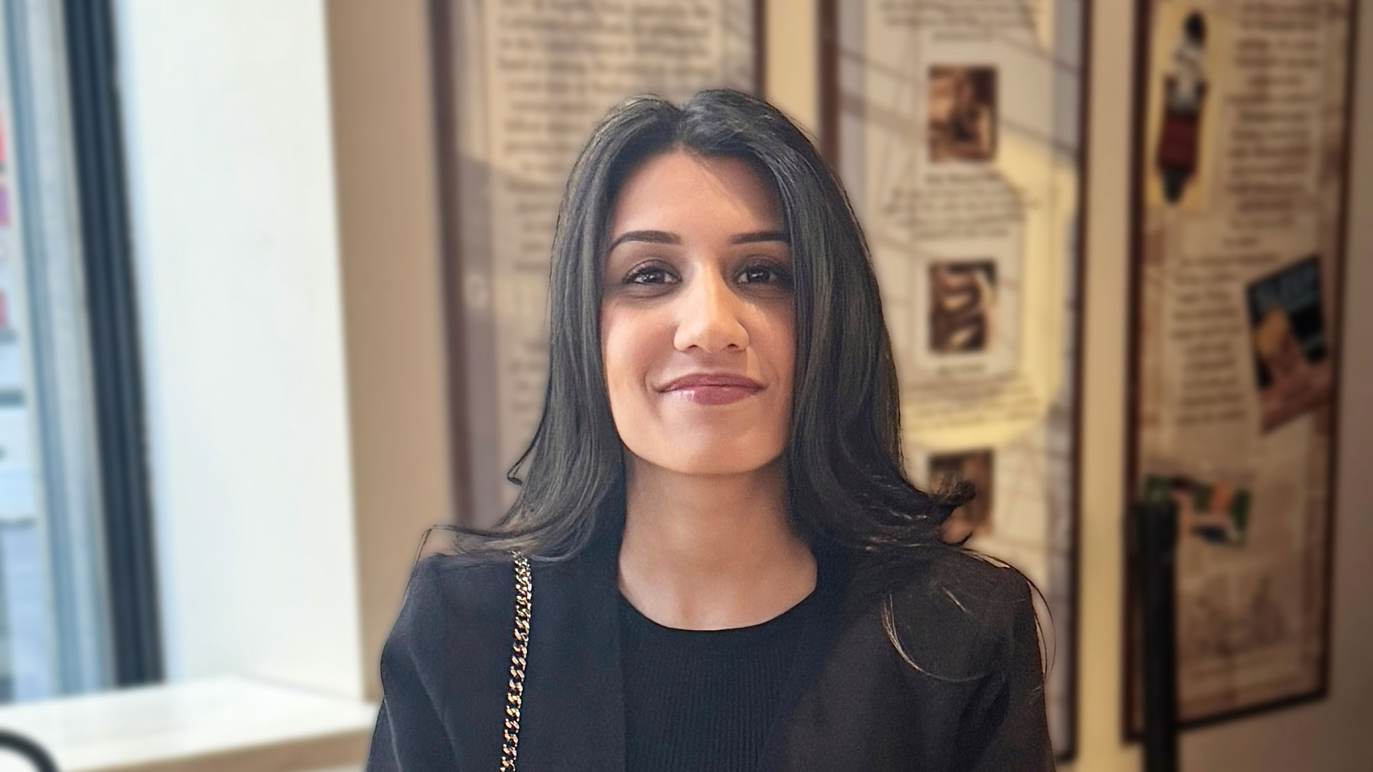
Samraddhi Shrotriya is a graphic and product designer of Discreet Vision whose work bridges brand identity, visual communication, and social impact, guided by the belief that design is not decoration, but a powerful tool for shaping how people understand and connect with the world around them.
I am Samraddhi Shrotriya, a graphic and product designer based in Las Vegas. I grew up in New Delhi and later moved to San Francisco to pursue my AA and MA in Graphic Design at the Academy of Art University.
My practice spans brand identity, product design, and visual communication, with a particular focus on work that exists at the intersection of design and social context. I currently work at Discreet Vision, where I lead design across technology and security-adjacent clients.
My journey into this industry was shaped by a deep conviction that design is not decoration—it is the way a message is received, understood, and remembered.
I submitted Safe S3X 4U because I believed the work deserved to be recognized within a context that takes design seriously as a discipline. The project was entirely self-initiated, meaning there was no client brief or external validation—only a problem I identified and a position I chose to commit to.
Winning Gold at the MUSE Creative Awards affirmed something I had already believed about the project: that clarity of intent and conviction in execution are recognizable regardless of subject matter. Professionally, it contributes to a growing body of recognized work. Personally, it matters because this project took a stand, and having that stance acknowledged is deeply meaningful to me.
Safe S3X 4U began with a single observation: nearly every visual system in sexual health communication was designed to minimize discomfort rather than build confidence. Clinical whites, anonymous typography, and apologetic copy created a language that treated the user’s experience as something to be managed quietly.
I wanted to challenge that approach. Looking to luxury editorial and fashion publishing, I questioned why visual systems that treat audiences with agency, confidence, and taste had never been applied to sexual health. The answer felt cultural rather than practical, so I chose to apply those principles directly. The result is a brand identity system that reframes sexual health as an act of self-respect.
The decision to treat the subject matter with the same visual seriousness as a luxury brand became the project’s defining differentiator. Most work within this space defaults to a visual language centered on safety and neutrality, whereas Safe S3X 4U was built around confidence, sophistication, and editorial authority.
The identity system employed high-contrast serif typography at editorial scale, alongside a palette inspired more by fashion publishing than institutional healthcare. Campaign applications extended across physical objects intentionally chosen to make the message visible within everyday environments. The project did not attempt to make the subject merely comfortable—it sought to make it respected.
The biggest challenge was making design decisions without external validation. There was no client to approve the direction, no formal brief to anchor the choices, and very little precedent within the category to reference. Every decision had to be internally justified against the core position of the project.
I overcame this by being extremely specific about the problem I was trying to solve—not sexual health communication broadly, but the visual language surrounding it, and the way that language often reflects cultural discomfort rather than actual user needs. Maintaining that level of specificity became the foundation that guided and clarified every design decision.
I hope this project demonstrates that self-initiated work—when driven by a genuine problem and supported by a clear position—can stand alongside commissioned work from established agencies. That matters to me because it reinforces the idea that the quality of thinking is just as important as the scale of the brief.
In practical terms, this recognition contributes to a growing body of work that I hope will lead to increasingly meaningful projects and conversations. While I have not yet seen dramatic changes, the recognition confirms that the direction I am pursuing is the right one.
Because this was a self-initiated project, the audience has primarily consisted of design peers and industry observers rather than a commercial client base. The response within those communities has been one of immediate recognition—people quickly understand what the project is arguing and why it needed to exist.
For me, that level of clarity without extensive explanation is the strongest indication that the design is doing its job effectively.
Start with a problem that genuinely bothers you, not one that simply feels safe to solve. Self-initiated work is only as strong as the conviction behind it. If you are creating work merely to fill a portfolio, that intention will show. But if you are creating work because you believe something genuinely needs to exist, that conviction will be visible as well.
Beyond conviction, specificity matters. A narrow and clearly defined problem almost always produces more coherent and compelling design than a broad, overly safe one. And most importantly, submit your work. The worst outcome is rejection, which costs very little but almost always teaches you something valuable.
The creative industry is entering a period where the tools available to designers have expanded dramatically, while the quality of thinking required to use them meaningfully remains unchanged. AI can generate visual outputs at a speed and scale that no individual designer can match.
What it cannot do is identify a problem worth solving, take a clear position on how to solve it, and maintain that position through the resistance that often comes with creating something genuinely different. That space between execution and conviction is where meaningful design practice exists, and it is the space I remain committed to working within.
Enter anyway. The discipline of preparing a submission forces you to clarify what you created and why it matters. That clarity remains valuable regardless of the outcome. And ultimately, the industry recognizes work it has actually seen.
Competitions are one of the few opportunities that allow work to gain visibility beyond the immediate client relationship. Do not wait until you feel completely ready. Submit the work you have, learn from the process, and continue submitting.
The work that matters is rarely the work that felt safest to create. Take clear positions. Be specific. Be willing to create something that will not appeal to everyone, because work designed to please everyone often fails to move anyone.
This project is dedicated to every designer who has faced a difficult subject and chosen the safe solution. This work exists because I chose not to.
A brand identity system that applies the visual authority of luxury editorial design to sexual health communication, based on the belief that the people it serves deserve to be addressed with confidence rather than apology.
I am continuing to build a practice at the intersection of brand identity and social impact, while also expanding my published writing on design criticism. Ultimately, I am working toward a body of work grounded in one consistent belief: that design is most powerful when it takes a clear position.