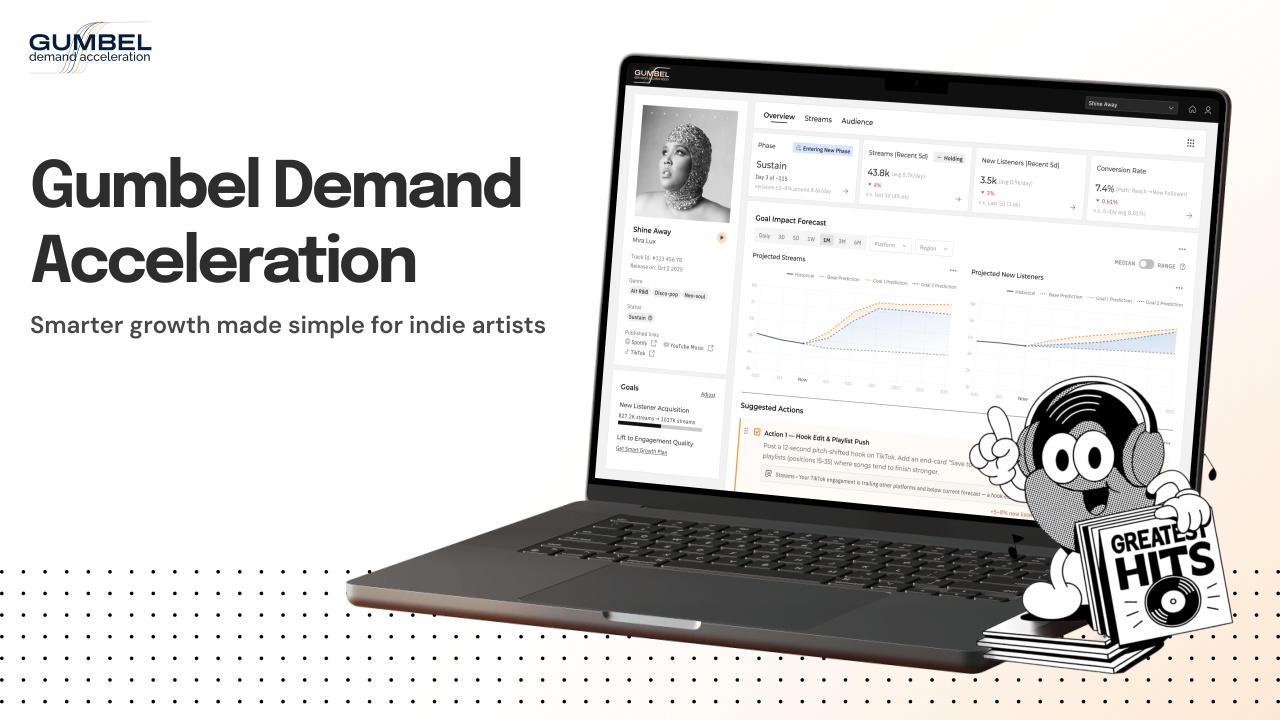
Gumbel Demand Acceleration
Gumbel is a creator-first analytics platform that transforms industry-grade music data into clear, actionable guidance...

United by a passion for clarity and human-centred problem solving, Zhixuan Zhang, Fan Zhang, Hanzhen Zhao, Meichen Wei, and Ziyi Wang focus on shaping digital products that feel intentional and intelligent. Their work spans 2B SaaS, AI platforms, enterprise software, and internal tools, all grounded in thoughtful research, technical understanding, and a drive to improve how people engage with complex technologies.
Zhixuan Zhang: I’m a product designer focused on 2B SaaS experiences, currently designing at IBM. I was inspired to pursue design because I’m drawn to complex, ambiguous problems and the challenge of translating them into clear, intuitive solutions that genuinely help people make sense of their world.
Fan Zhang: I’m a founding product designer at an AI startup. My background in computer science and architectural design naturally led me to product design, where I can combine technology and design to create thoughtful, human-centred products.
Hanzhen Zhao: I'm a product designer at an AI startup. I was drawn to design by a desire to refine how products feel and function, to create better experiences, elevate taste in digital products, and explore more human-centred ways of interacting with AI.
Meichen Wei: I'm a product designer and researcher, and my recent focus has been on enterprise software. I am deeply passionate about creating design solutions that grow directly out of a deep understanding of users and their needs and wants.
Ziyi Wang: I’m a UX designer focused on enterprise and internal tools. I enjoy simplifying complex systems through thoughtful experience design. I currently design internal products at a financial services company to improve employee efficiency and workflows.
As a team, being recognised by the London Design Awards is incredibly meaningful to us. It affirms our belief that design should help people navigate technology with clarity rather than stress, and that thoughtful experiences can open access to opportunities that were once limited to a few.
With Gumbel, we believe every creator deserves industry-level intelligence; therefore, our platform empowers independent artists with affordable, data-driven insights while we handle the complexity behind the scenes. This recognition encourages us to keep exploring how human-centred thinking and emerging technologies can promote equity and inclusion, support creators of all backgrounds, and bring confidence, simplicity, and dignity back to their interactions with music analytics.
Fan Zhang: This recognition reinforces the value of making complex data accessible and highlights the importance of thoughtful AI design. It motivates me to continue turning complexity into clarity and building experiences that help people interact with AI in more intuitive and meaningful ways.
Zhixuan Zhang: This award is a meaningful milestone for me. After years of designing complex 2B systems, Gumbel allowed me to explore how technology can give everyday creators access to intelligence once limited to industry insiders. The recognition encourages me to keep designing experiences that simplify complexity and empower more people to make confident, informed decisions.
Hanzhen Zhao: This recognition validated my core pursuit as a designer: making complex information accessible through visual clarity. Working on this project reinforced how design can turn data visualisation into something dynamic and predictive, empowering new artists with real insights. It's strengthened my commitment to exploring AI-driven design as the direction I want to continue developing.
Meichen Wei: Being recognised has strengthened my confidence in designing AI- and data-driven products from a human-centred lens. Through collaborating with my fellow designers on this project, I am inspired to keep practising turning complex analytics into approachable tools, and have been having new conversations about applying our approach to future AI projects and collaborations.
Ziyi Wang: This recognition boosted my confidence in delivering meaningful value through intuitive design beyond my core work in internal and enterprise tools. It also validated our team’s exploration of more intuitive, AI-driven ways of thinking about and interacting with data, reinforcing that this direction is worth continuing to pursue.
Experimentation is central to our process, especially when working with data-heavy products like Gumbel Demand Acceleration. We explored a wide range of visualisation approaches- testing how different layouts, chart behaviours, and interaction patterns shaped users’ ability to interpret signals and understand what actions to take. Each variation helped us see which elements supported clarity and which ones created unnecessary cognitive load.
By prototyping quickly and validating each iteration with artists, we could observe how real creators made sense of momentum, reach, and audience reactions. These experiments revealed surprising patterns in how they read data, which directly informed how we structured the interface. The result is a system that feels intuitive on the surface yet deeply analytical underneath, an experience built through iterative learning rather than assumptions.
For this project, one of the most unusual sources of inspiration came from watching how independent artists talk about their music on social platforms; not the analytics, but the language they use to describe momentum, intuition, and “gut feelings.” Seeing how they interpret spikes, drops, and audience reactions in a narrative way inspired us to translate complex data into visual patterns and story-like signals they could immediately relate to. It helped us design a system that feels less like a dashboard and more like a readable pulse of their creative impact.
We wish more people understood that design is fundamentally a process of creating clarity. Before anything becomes a screen or a visual system, we spend a lot of time untangling ambiguity- figuring out what the real problem is, who it impacts, and what information they actually need to move forward. The outcome often looks simple, but the path to that simplicity is rarely straightforward.
With a data-heavy project like Gumbel, the complexity becomes even more invisible from the outside. Most of our effort went into making sense of the underlying signals, exploring different ways to frame momentum, and testing whether artists could read a chart and instantly understand what action it implied. Good design in this context isn’t about decoration; it’s about structuring information in a way that removes cognitive friction and gives people confidence in their next step.
We also wish more people recognised how iterative and exploratory the process really is. We tried dozens of visualisation patterns, narrative framings, and interaction models before we found the ones that felt natural to creators. Design is less about having the perfect idea at the start and more about continuously learning, refining, and shaping the product around real human behaviours. That invisible iteration is what ultimately makes an experience feel effortless.
For us, balancing client expectations with our own ideas starts with alignment on the problem, not the solution. When everyone shares a clear understanding of the outcome we’re trying to create, it becomes easier to evaluate ideas based on whether they genuinely move us closer to that goal. That shared foundation gives the team room to be flexible without losing direction.
On Gumbel, this often meant translating our vision for clarity into forms that still met the practical needs of data and industry stakeholders. Instead of insisting on one “ideal” direction, we brought multiple explorations that demonstrated how different visualisations or flows could satisfy both user understanding and business constraints. This approach made conversations more collaborative and helped clients see the reasoning behind the design, not just the visuals.
Ultimately, we’ve learned that staying true to our ideas doesn’t require rigidity; it requires protecting the intent behind them. As long as the final product still simplifies complexity, empowers users, and reflects the core experience we set out to create, we’re comfortable iterating on the details. That mindset turns tension into partnership and leads to stronger, more thoughtful outcomes.
One of the most significant challenges was bridging the gap between a complex, data-intensive system and the needs of beginners who often feel overwhelmed by analytics. The dashboard contained rich insights, but without thoughtful design, it could easily become inaccessible to anyone without experience. Our challenge was to create an interface that felt intuitive and supportive, something that not only simplified the data but also guided users toward meaningful decisions.
We tackled this by deeply rethinking the information architecture, identifying the core signals users needed, and designing ways to surface them at the right moments. We layered in context, explanations, and visual cues that help users understand not just what the numbers say, but why they matter. Through iterative testing and close collaboration with product and engineering, we refined the design until it felt both powerful for advanced users and approachable for beginners.
Ultimately, the solution proved that with the right design, even the most complex systems can feel human, clear, and empowering.
When we hit a creative block, we usually step away from the screens and reconnect with the real contexts our work is meant to support. For Gumbel, that often meant immersing ourselves back into how artists actually talk about their music, momentum, and audience, hearing their language again helps reset our perspective and reminds us of the human side behind the data. That shift in focus often sparks new ideas more effectively than forcing another round of iterations.
We also find it helpful to explore references far outside of product design. Looking at editorial layouts, motion graphics, or even scientific diagrams often reveals new ways to communicate patterns visually. These unexpected formats help us think about data and storytelling in fresh ways, especially when we’re trying to simplify something complex.
One value we consistently bring into our work is the belief that technology should expand access, not reinforce barriers. With Gumbel, that meant designing from the perspective of people who don’t have teams of analysts behind them, independent artists, early-stage creators, and anyone trying to make sense of complex data on their own. We focus on removing intimidation, building clarity, and giving users a sense of control, because we’ve seen how empowering it is when someone can confidently understand information that once felt out of reach.
We also draw heavily from our experiences navigating complexity ourselves, whether in enterprise systems, data tools, or creative workflows. Those moments of confusion and overexposure to information remind us how important structure, storytelling, and empathy are in product design. They push us to create interfaces that feel human, grounded, and supportive, especially for users who may be encountering unfamiliar technology for the first time.
Focus not only on how your designs look, but on how the whole system works. Take the time to understand the product architecture, the technology stack, and the real constraints your team is working with. When you can zoom out to the bigger picture and think systematically, across states, edge cases, and long-term impact, you become a much more strategic designer, and your work naturally becomes more meaningful and successful.
If we could collaborate with anyone, we would choose Edward Tufte. He isn’t a traditional designer in the visual or industrial sense, but his analytical approach to information design, as well as his insistence on clarity, honesty, and precision, deeply inspired us during our research for Gumbel. His work showed us how data can become a narrative rather than just a chart, and how removing noise can actually reveal the most meaningful signals.
Collaborating with him would push us to further refine how complex creator analytics are translated into intuitive patterns, especially for users without data backgrounds. His perspective on visual reasoning could help us communicate momentum, audience behaviours, and creative impact in a way that feels immediate and accessible, empowering independent artists with insights that were once locked behind industry expertise.
A question we wish people would ask is: “How do you decide what level of complexity users should actually see?” It’s one of the most fundamental choices we make, especially on projects like Gumbel, where the underlying system is rich, technical, and full of nuance. Most of the design work happens before anything is visual, deciding what to reveal, what to frame, and what to quietly handle in the background.
For Gumbel, we spent a lot of time understanding how artists interpret signals, what they overestimate, and what they tend to overlook. Instead of exposing every metric, we focused on shaping the information that truly affects their decisions, and turned the rest into context or supporting cues. That judgment, what stays in the foreground versus what becomes part of the system’s logic, is a creative and strategic act that often goes unnoticed but defines the entire experience.
Our answer is that clarity is not the absence of complexity; it’s the intentional structuring of it. When people ask about charts or UI patterns, we hope they also ask about the thinking behind them, the invisible layers of research, synthesis, and restraint. That’s where the heart of our work lies: translating complicated systems into something people can understand, trust, and act on with confidence.
Explore From Concept to Symbol: The Visual Reductions of Wynn Chen by clicking this link here.