Safe S3X 4U
Safe S3X 4U is a self-initiated brand identity for sexual health communication targeting young women.

Samraddhi Shrotriya is a graphic and product designer based in Las Vegas whose work explores how visual language shapes emotional perception and human behaviour. Through projects like Safe S3X 4U, she uses experimentation and iterative design to challenge assumptions and create more honest, user-focused experiences.
I am Samraddhi Shrotriya, a graphic and product designer based in Las Vegas. I grew up in New Delhi and came to the United States to study at the Academy of Art University in San Francisco, where I completed my MA in Graphic Design. What drew me to design was the realisation that it is one of the few disciplines where you can shape how people feel about something before they even have a chance to think about it. That kind of responsibility felt worth taking seriously.
It means the work is being seen beyond the context in which it was made. Safe S3X 4U was designed to challenge how an entire category communicates with the people it is supposed to serve. Having that recognised by an international jury confirms that the argument the work is making is being understood, not just the aesthetics.
Recognition like this opens conversations that would otherwise take much longer to start. It validates the decision to take on work that the industry typically avoids and makes it easier to argue that design has a responsibility to the people who need it most, not just the clients who can afford it most comfortably.
Experimentation is how I find out whether my assumptions are wrong. With Safe S3X 4U, I went through three distinct iterations over two years, each time questioning whether the visual language I had chosen was actually serving the person it was made for or whether it was still making compromises for the comfort of everyone else in the room. Each iteration got closer to removing those compromises.
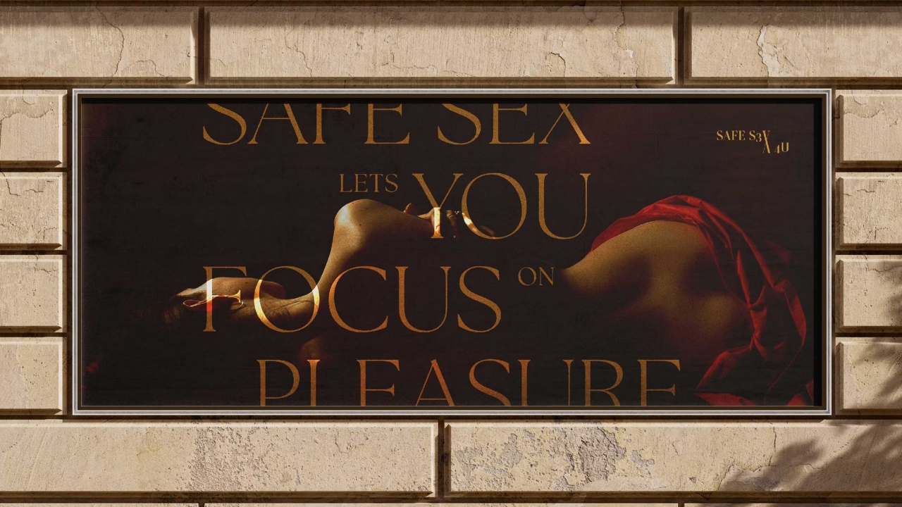
For Safe S3X 4U the reference point was Renaissance painting. The figure in the campaign imagery draws from the visual language of classical portraiture, where the body is treated with dignity and aesthetic seriousness. That felt like the right counter to the clinical distance that dominates health communication. If the category defaults to anonymity, the answer is specificity and presence.
That the visual decisions a designer makes are never neutral. Every typeface, every colour, every object chosen for a campaign is a statement about whose experience matters and how much. Playing it safe is not an absence of a position. It is a position. It just happens to be the one that serves the most comfortable audience.
By making sure the conversation is always about the person the work is actually for rather than about my preferences or the client's comfort. When both sides are focused on the end user, the disagreements become smaller and more productive. When either side loses sight of that person, the work suffers.
The biggest challenge was resisting the pull of the category's existing visual language. Every reference I found reinforced the same clinical approach. The way through was to stop looking at what existed in the category entirely and instead look at what the person the work was for actually wanted to be associated with. That shifted everything.
I read. Not design. Literature, philosophy, history. Design blocks usually come from looking at too much design. The solution is almost always to look at something completely unrelated until a connection forms that would not have been obvious otherwise.
A deep discomfort with design that manages people rather than respecting them. I grew up navigating spaces where the design around me communicated clearly that I was not the intended audience. That experience made me attuned to the difference between work that is made for someone and work that is made despite them.
Take the brief nobody wants. Not because it will make you famous but because the problems the industry avoids are the ones where design can do the most. The comfortable briefs produce comfortable work. The uncomfortable ones produce work that matters.
Wally Olins. He spent his career arguing that brand identity is organisational behaviour, not visual style, and that a system only works if the people inside the organisation understand why it exists, not just what it looks like. That is a conversation I would want to be part of for as long as possible.
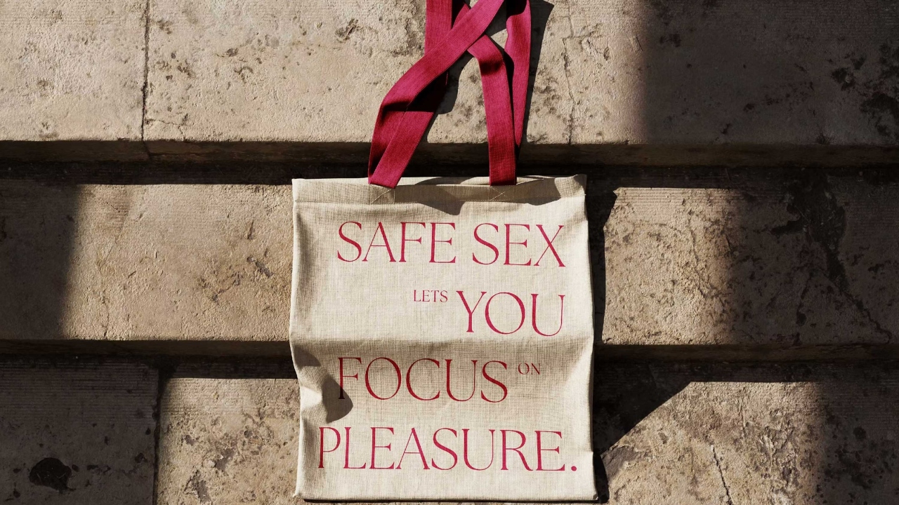
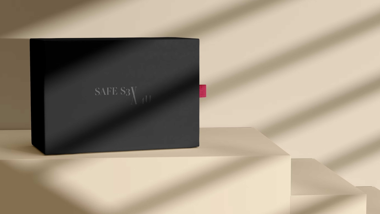
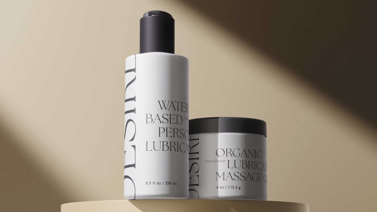
I wish people would ask why the work looks the way it does rather than what it is about. The visual decisions in Safe S3X 4U, the editorial serif, the warm palette, the objects chosen for public visibility, are not aesthetic preferences. They are arguments. Every decision is a position on whose experience is worth being associated with in public. That is the conversation I want to have about design.

Click here to view the interview on Inclusive Healthcare Design Through the Work of Zhang Jingyue.