From Flash to Fintech: Viacheslav Derzhaiev Shares His Path to Product Innovation
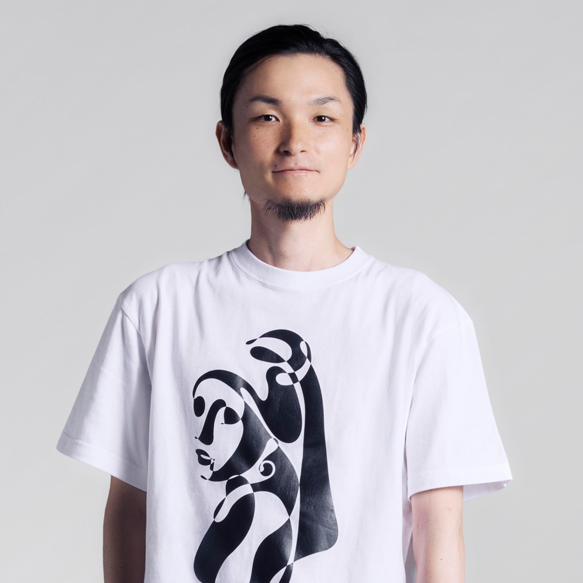
Viacheslav Derzhaiev
Product designer and entrepreneur Viacheslav Derzhaiev combines his early creative roots with deep business acumen. His journey from agency work to fintech startups allows him to craft designs that are both innovative and strategically informed.
I'm Viacheslav Derzhaiev, a product designer and a founder. Design has been part of my life since my university days. I was building Flash websites (remember that?), designing posters, flyers, t-shirts, and CD covers as a side gig to earn some money. But I had dreams of becoming an entrepreneur someday, so I decided that I needed to understand the business side first.
I deliberately stepped away from design and spent some time learning marketing and strategy. I worked at creative agencies like BBDO and Leo Burnett, then moved to management consulting at Bain & Company. I worked with Fortune 500 companies and major international corporations, but at some point, I realized I didn't want to just create strategies anymore; I wanted to build.
So I co-founded my first startup, a fintech app. I came back to design, but now with this whole business toolkit. I learned to code, dove deep into product design, UX research, and user psychology, and discovered that I could combine the creative side of design with the strategic thinking I'd developed.
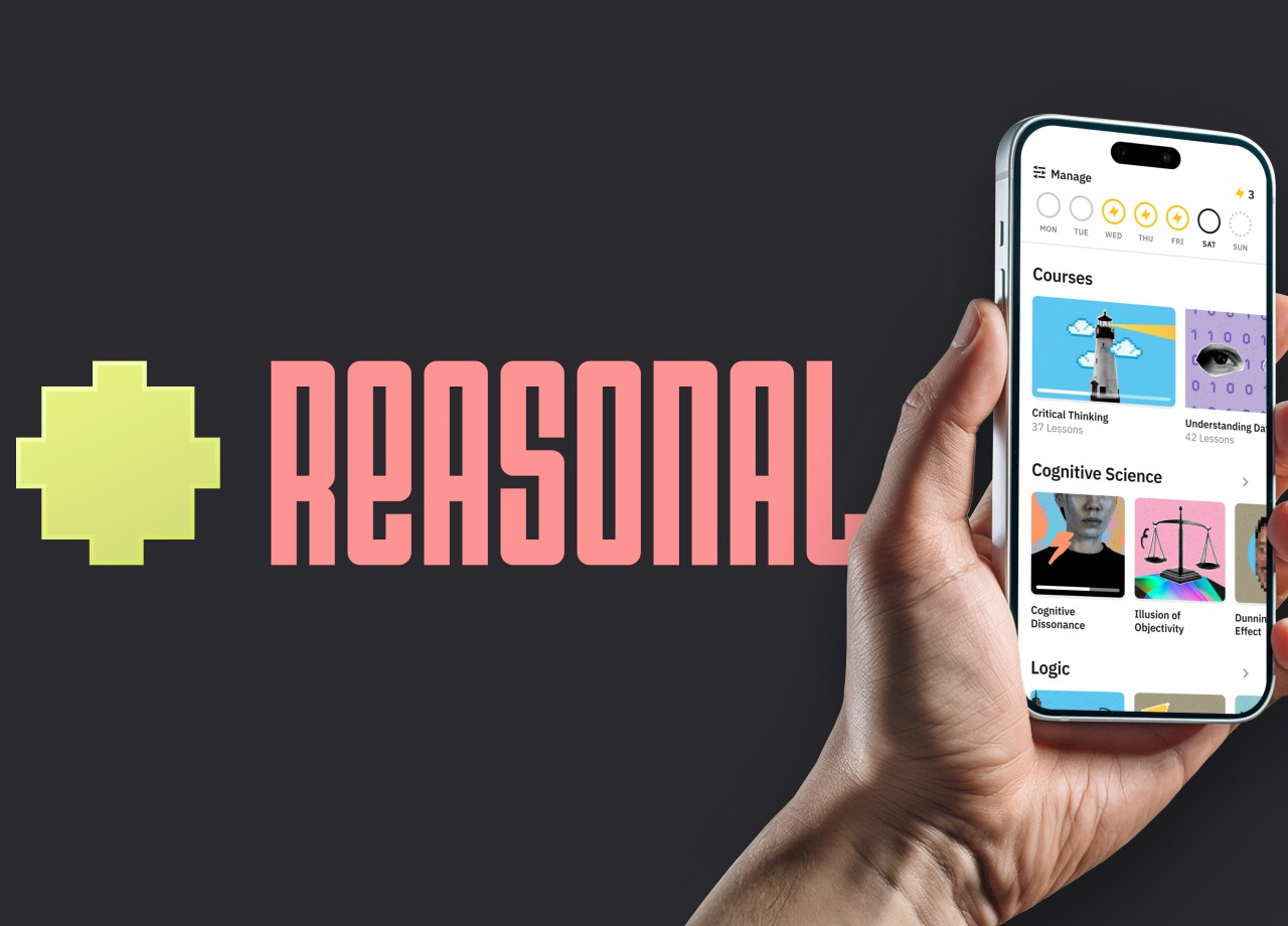
Honestly, it's validating in a way I didn't expect. I won an award for Reasonal, an app I built to teach critical thinking through real research and branching interactive lessons. It isn't backed by venture capital—it's just me building something I think needs to exist, paying experts out of my own pocket when I need help. When you're working solo on something as ambitious as teaching critical thinking, you question yourself constantly. Is this actually working?
Does it really help people? Because the lack of critical thinking (the ability to evaluate information, see manipulation and disinformation) is one of the biggest problems we're facing, and AI is making it worse. Education-based solutions for this are often seen as too slow, too idealistic. So this award validates that the work is worth doing and that it can be done well.
It has attracted some interesting conversations: educators reaching out asking about the methodology, other designers curious about how I built the branching narrative system and an app as a solo founder, and even a few potential collaboration inquiries. Nothing concrete yet, but the kind of attention that could lead somewhere meaningful.
Experimentation is how I learn what actually works versus what I think should work. At my previous startup, we had a "classic" purchase flow: create an account, select a plan to start a trial, and access the app. We had a decent conversion from trial to paid, but not enough people were starting the trial in the first place. I had a hypothesis that if people could just try the app immediately after signing up, more people would see the value and convert later.
I redesigned the flow so users could access the app immediately after creating an account, and we'd show them the paywall seven days later. This failed spectacularly. Even fewer people signed up. When I removed the explicit paywall, people became more suspicious. They saw "Free for 7 days" on the signup screen and assumed there was a hidden price somewhere they couldn't see. They thought they'd get charged without realizing it.
For a new app from a new startup, people aren't thinking about the benefits they can gain. They're worried about the money they might lose to a forgotten subscription—they're in a prevention-focused mindset. So I redesigned the flow again, showing exactly when they'd get access, when they'd be reminded, and when they'd be charged. There's a detailed case study with all the data and design iterations on my website.
A government website, actually. I was filling out some form, and I noticed the questions changed based on my previous answers. And I thought: why was I building the lessons for my educational app as linear content?
Everyone sees the same thing in the same order, like a textbook. But people come in with different knowledge and different misconceptions. A branching structure would let the content adapt—as if you could have a conversation with a really well-written article in a well-designed magazine. I went back and redesigned the entire content architecture.
That users spend 95% of their time on apps and websites that aren't yours. So it's actually kind of arrogant to think they'll suddenly learn your unique vision and way of doing things just because you think your approach is differentiating you.
The default should be: follow conventions, remove unnecessary friction. Of course, sometimes friction is intentional and serves a purpose. But it should always come from a clear hypothesis. It should be a matter of "why", not "why not."
My entrepreneurial background helps. I understand that we aren't just making art here; the design needs to work and solve business problems. It's not just about me or my "creative vision." If you work for somebody, you're basically hired to deliver their message and vision in the most efficient way. It's a job, like many others. That said, there's a difference between some personal preferences and things that will actually hurt the product.
If someone wants a sky blue button instead of teal because they prefer sky blue, fine. But if they want to add unnecessary friction to a flow or ignore what testing shows, that's where I'll push back with all the data, articles, examples, and research.
The biggest challenge was designing a branching narrative experience that felt natural, not like a clunky "choose your own adventure" book. Each lesson needed multiple paths based on user responses, but I also needed to guarantee that everyone learned the core concepts, no matter which path they took.
I couldn't make it completely open-ended, because then some users might miss important angles. And I didn't want to use AI to generate or adapt my content, because it still hallucinates research findings, blurs disconnected concepts together, or just makes things up. I wasn't going to teach critical thinking with the AI slop.
So the content architecture got complex fast, with dozens of possible routes through each topic. I built a mapping system to visualize all paths and decision points, then coded the logic to make it feel automatic. Users don't see the branching; they just experience content that responds to them. I also manually review all content with experts to ensure it's well-researched, fact-checked, and well-written. It's slow, but necessary.
I run. A lot, actually. I like running half-marathons, so most of the time I'm training for one. I don't want you to think I'm good at it or anything, but I like running; it clears my head. You know how, when you're actively thinking about something, you start pacing around the room?
There's something about physical movement that helps the brain work better. I also used to make electronic music and DJ when I was younger; it was a form of meditation for me. I stopped doing it at some point, but I've been thinking I should start again.
I'd call it respect for people's intelligence. There's a quote from David Ogilvy, the advertising legend: "The consumer is not a moron, she's your wife." We shouldn't think we're much smarter than our users, or that we can easily trick them into doing what we want.
That's why I don't use dark patterns or psychological manipulation. It's fine to use consumer psychology and address blockers, but you need to be honest and transparent about it. It's not some type of moral superiority or high-brow idealism. It's very pragmatic. You can only trick people so many times before they figure it out, and then your retention suffers anyway.
Build real things. I'm obviously biased because I like doing it, but with all the AI and design tools nowadays, it's too easy to fake pretty mockups or well-written case studies. But what you can't fake is actual users using your product. You can build free tools, browser extensions, plugins, and small apps that solve real problems.
The entry barriers are incredibly low now: you can vibe-code it, launch it, and get real feedback. That way, you can show you understand and solve real problems, not just move rectangles around in Figma.
Dieter Rams, without question. For me, his work is the standard for what good design means: simple, honest, practical, long-lasting. He believed designers should respect users and the environment, not just drive consumption. What I'd want to learn from him is how he kept those principles while working in a big corporation like Braun.
It's easy to have strong ideals when you're independent, but it's much harder when you're dealing with boards of directors, shareholders, office politics, market pressures, and manufacturing realities. He figured out how to make products that were beautiful but could also be mass-produced, adhered to his principles, and were somehow profitable.
I wish people would ask: "How do you use AI in your design work?" Because the conversation around AI has become really polarized. You have one camp saying AI kills creativity and will replace designers. Then you have another camp doing AI-generated everything, creating "AI art" and calling themselves prompt engineers and AI artists. I'm not in any of those camps.
To me, AI is a tool. I use it for mundane, repetitive, technical things: finding research data, finding recent real-world examples, proofreading, optimizing code, searching through documentation, testing, and fixing errors in my code. But I don't let it replace my point of view, my critical thinking, my ideas, or my logic.
After AI finds me something or suggests changes, I actually look for the source, read it, fact-check it, and verify the logic. I expect the same from other designers and products. It's fine if you use AI for optimizing your database, but I won't read your AI-generated "article."
Winning Entry
Discover insights from the NY Product Design winner through the interview - Insights from Sooyeon & Jooyeon for their Award-Winning Project - Lumie here.



IAA GLOBAL AWARDS
MUSE Awards
Vega Awards
NYX Awards
TITAN Awards
- TITAN Business Awards
- TITAN American Business Awards
- TITAN Property Awards
- TITAN Women In Business Awards
- TITAN Health Awards
- TITAN Innovation Awards
- TITAN Brand Awards
