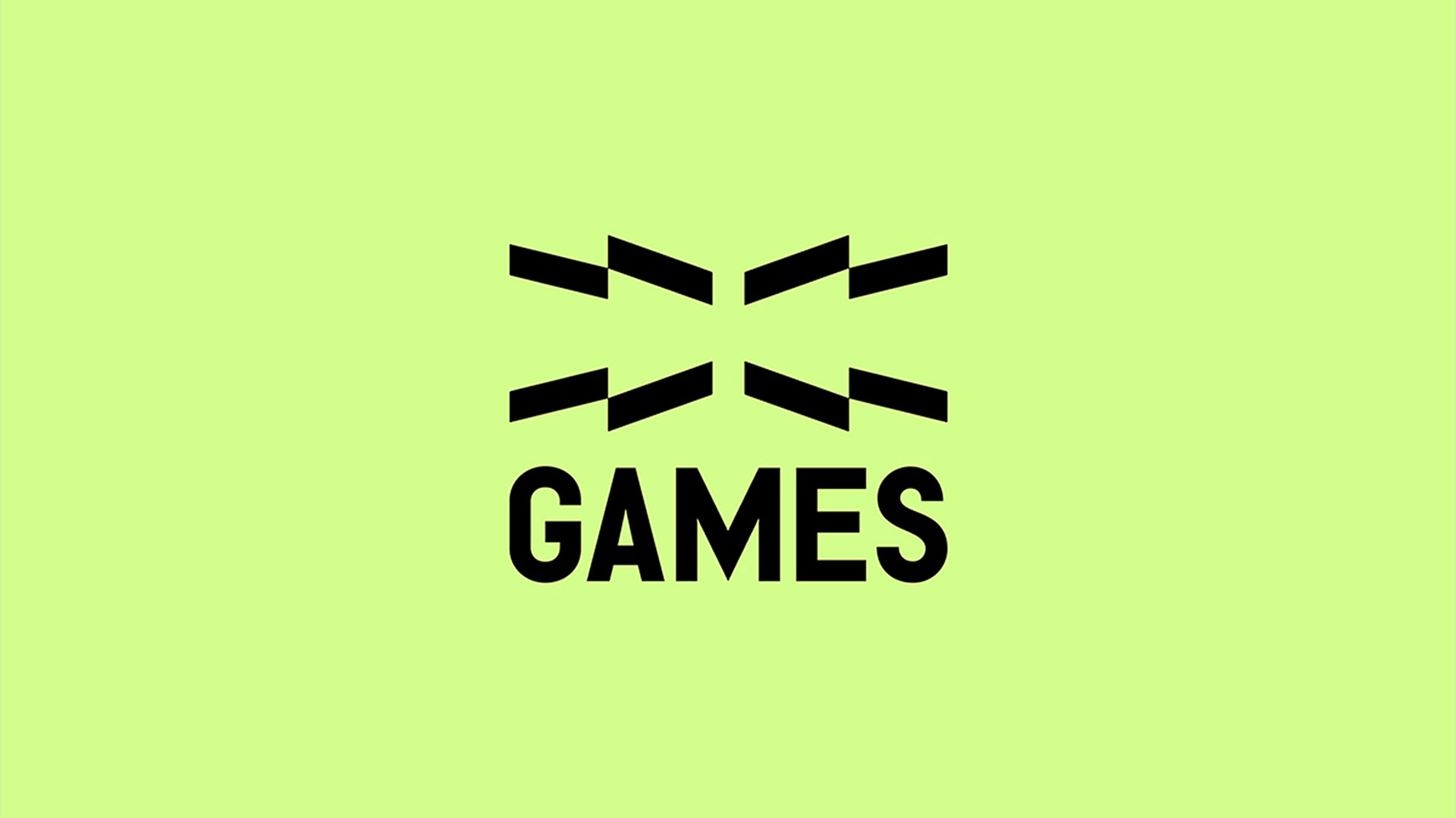
X Games
X Games is an annual action sports event spotlighting skateboarding, BMX, motocross, and snowboarding. This...

Gwen Geng is a multidisciplinary graphic designer creating bold, motion-driven visual systems where typography, storytelling, and spatial design come together to form immersive experiences across digital and physical mediums.
I’m a multidisciplinary graphic designer currently based between Los Angeles and Seattle. My work spans typography, motion, interaction, and spatial installation, driven by a curiosity for how ideas can take form across different media.
Over the past few years, I’ve worked with studios such as Pentagram, Massive Assembly, and Amazon, collaborating with clients including Riot Games and EA Sports. My work has been recognized by organizations such as the Art Directors Club, Type Directors Club, Communication Arts, and Core77.
Before design, I studied mathematics. What stayed with me wasn’t calculation, but a way of thinking: seeing connections, patterns, and structures between things that don’t immediately relate. I found myself constantly building visual interpretations in my mind of what I saw, heard, and felt — sometimes simple, sometimes highly structured.
I entered design when I realized I needed a way to bring those internal images outward. Graphic design became the medium that allowed me to externalize that process, bringing together different forms and transforming something intangible into something people could truly experience. That realization is what ultimately led me into this field.
I’ve always seen competitions less as a way to prove something and more as an opportunity to place my work within a broader context. It allows me to see how an idea holds up alongside many different approaches and perspectives.
Winning, to me, is less about validation and more about recognizing that this line of thinking resonates with others. Professionally, it opens up new conversations and connections. Personally, it gives me the confidence to keep pushing in this direction.
The project began with a disconnect I noticed.
X Games is built on speed, unpredictability, and progression, yet many sports identities still feel relatively static. I wanted to explore how a visual identity could better reflect the nature of the sport itself.
That led me to focus on the letter “X” not simply as a logo, but as a system. Its geometry became a framework capable of generating movement, perspective, and variation across different applications. In today’s design landscape, I think it reflects a broader shift toward identities that function less as fixed outputs and more as evolving systems, especially within environments shaped by digital platforms and real-time content.
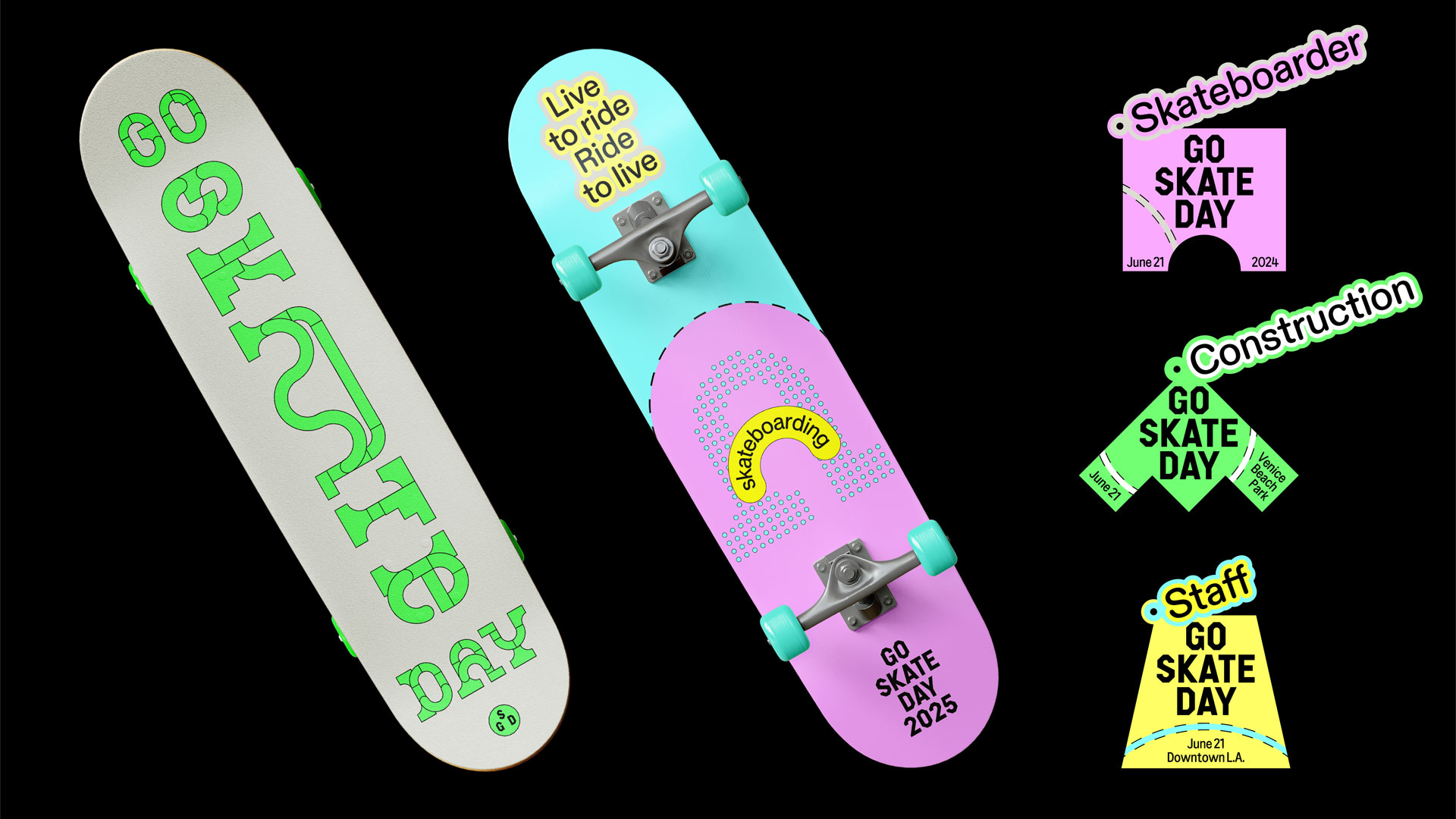
What set it apart was the consistency between concept and execution. The entire system was built from a single structural logic — the geometry of the “X.” This created a unified visual language across typography, layout, and motion while still allowing room for variation.
At the same time, the system was designed to adapt to speed and change, making it especially relevant for digital and real-time environments.
One challenge was finding the right balance between flexibility and control. Because the system is based on transformation and perspective, it could easily become too chaotic or unclear. I had to refine the system’s rules so it could generate variation without becoming visually overwhelming.
That process involved extensive iteration, testing how far the distortion and perspective could be pushed while still maintaining legibility and brand recognition.
I see it less as a milestone and more as a signal. It demonstrates that this way of building identities — as systems rather than fixed assets — can function effectively in real-world contexts. That gives me greater confidence to continue developing the idea and applying it to projects that demand scale, speed, and flexibility.
On a practical level, it also helps create more specific conversations with collaborators and clients. Instead of explaining the concept from scratch, I can point to something tangible and say, “This is what it can do.”
A lot of the feedback has focused on how the identity feels more aligned with the energy of the sport. People often mention the sense of movement and intensity, even within still visuals.
That was exactly what I aimed to capture: moments that are usually too fast to fully register. It’s also interesting to see how different people interpret the system in their own way, which reflects the diversity within the X Games community itself.
I think it’s important to build a strong connection between concept and execution. A project becomes more compelling when every visual decision can be traced back to a clear idea. That doesn’t mean the work has to feel rigid, but it should always feel intentional.
At the same time, it’s equally important to leave room for exploration. Some of the most interesting results come from pushing a system beyond what you originally expected.
Media is becoming more dynamic, and so are the tools shaping it. With real-time systems and AI, design is shifting away from fixed outputs toward experiences that adapt and evolve. I’m interested in working at that level — designing how something behaves, not just how it looks.
I think competitions are valuable not just for recognition, but also for reflection. Preparing a submission forces you to clarify your ideas and articulate your process, which in itself can be incredibly useful. Rather than seeing it purely as judgment, I see it as part of the development process behind the work.
Stay open to thinking beyond the format you’re working in. A strong idea should be able to move across different media and still retain its core. The more flexible your thinking becomes, the more possibilities you create for the work.
A branding system that transforms the letter “X” into a dynamic structure designed to capture the speed, risk, and progression of action sports.
I’m interested in continuing to develop branding systems that extend beyond static visuals. That includes exploring how identities can exist across motion, interaction, and spatial environments, particularly in contexts where speed and change are essential.