TA Solivare
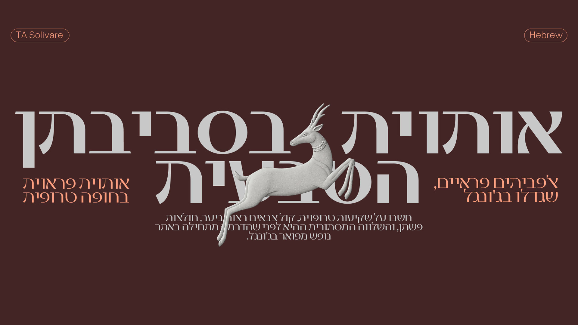
TA Solivare is a distinct display typeface that brings the raw, lush energy of the...
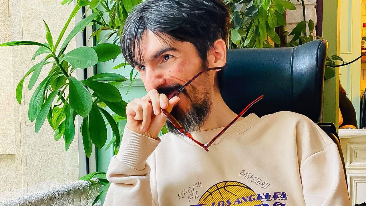
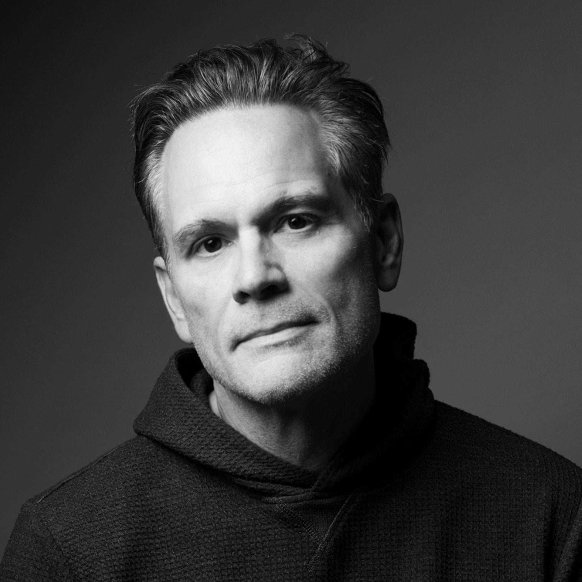
Tural Əlisoy is an independent type designer, type engineer, and founder of TAFT Foundry in Baku, Azerbaijan, specializing in multi script typography and culturally nuanced type systems across Latin, Cyrillic, Greek, Georgian, Armenian, Hebrew, Arabic, and Thai.
Thank you! I am Tural Əlisoy, an independent type designer, type engineer, and the founder of TAFT Foundry, based in Baku, Azerbaijan. We specialize in multi-script font engineering and retail typefaces, with a focus on harmonizing scripts such as Latin, Cyrillic, Greek, Georgian, Armenian, Hebrew, Arabic, and Thai. I am entirely self-taught.
My journey began in 2011, when I started learning graphic design. As my interest in the architecture of letterforms deepened, my focus shifted, and in 2017, I transitioned fully into type design and font engineering, dedicating myself to building comprehensive, culturally authentic typographic systems.
Submitting TA Solivare to the MUSE Creative Awards was driven by a desire to showcase the beauty and complexity of multi-script typography on a global platform. This project represents a significant amount of research and engineering aimed at achieving structural harmony across diverse writing systems.
Winning Gold is incredibly rewarding on a personal level. Professionally, it strengthens TAFT Foundry’s international presence, demonstrating that an independent studio from Baku can compete at the highest levels of global design while building greater trust with our global clients and fellow designers.
The story behind this success stems from an experiment with classical typography. Initially, I set out to create a sans-serif typeface inspired by the classic, monumental proportions of the “Trajan” font, a style known in typography as Roman epigraphic.
My goal was to strip away the traditional serifs while preserving that timeless elegance and ensuring a high level of legibility. I feel I have partially achieved this initial vision, though the typeface naturally evolved during the design process, taking on its own distinct, wild tropical character. I still have further improvements and refinements planned for the future.
In today’s industry, I believe TA Solivare represents the courage to blend strict historical foundations with highly expressive, contemporary aesthetics, proving that a display font can be fiercely unique without sacrificing readability.
I believe what set my project apart in a highly competitive field is the uncompromising balance between extreme visual expression and profound technical depth. Often in type design, highly decorative display fonts offer very limited character sets, while massive multi-script families tend to play it safe visually. My project challenges this by delivering a fierce, untamed aesthetic across a massive typographic system.
A specific strategy that made it stand out was my approach to multi-script harmonization. Instead of simply forcing Latin structural logic onto Cyrillic, Greek, Georgian, Armenian, and Hebrew, with plans to expand into Arabic and Thai scripts as well, I focused on maintaining the intrinsic graphic character and cultural authenticity of each script while infusing them with the same retro tropical energy.
I backed this bold aesthetic with rigorous engineering, including advanced OpenType features, precise diacritic anchor placements, and collaborations with native script consultants, ensuring it performs flawlessly across languages.
A major technical challenge was maintaining the font’s signature “loose, hand-drawn curves and retro energy” across all weight variations without losing the integrity of the design. However, the most significant obstacle was the multi-script harmonization process.
My primary goal was to preserve the original characteristics of each script and ensure they did not simply look like “Latin” adaptations. Translating this wild, tropical display aesthetic into complex scripts like Greek, Cyrillic, Georgian, Armenian, and Hebrew required deep structural analysis. I had to ensure that the highly expressive design did not violate the traditional rules or cultural authenticity of each writing system.
I overcame this by actively consulting with native script experts and rigorously refining the contours until the perfect balance between global harmony and individual script authenticity was achieved.
Winning is a powerful milestone for TAFT Foundry. In the long run, I hope this achievement cements our reputation as an independent studio capable of delivering highly expressive, culturally authentic multi-script typefaces on a global scale.
Gaining this level of recognition as an independent foundry demonstrates that we can deliver complex typographic systems that meet world-class standards on par with those of larger agencies. It serves as a significant stepping stone toward securing more international font licensing and custom typography commissions.
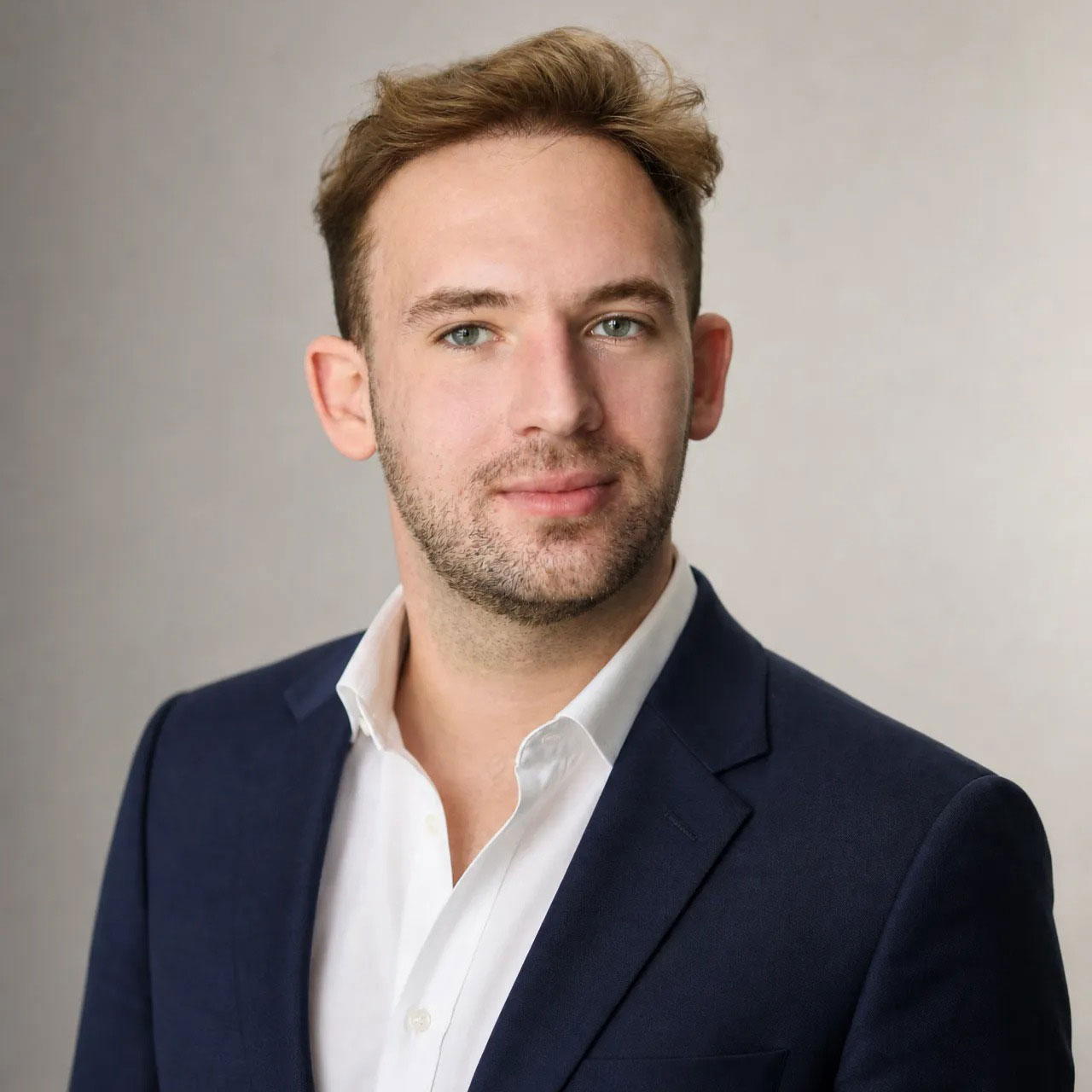
This project has been very successful for me because there was already a demand for it among both agencies and designers. I hope this recognition will generate even more interest and attention. I must also emphasize that the beautiful presentation created by graphic designer Mubariz Yusifzade played a huge role in making the typeface look even more stunning and contributing to this success.
It opens new doors for deeper conversations and potential collaborations with industry peers and agencies who value authentic, high-quality type engineering. Ultimately, being recognized at this level gives me great motivation to push the boundaries even further in my future projects.
The reactions have been incredibly inspiring. I received likes and congratulatory messages from both graphic designers and type designers whom I know and whose work I deeply admire.
Having colleagues whom I follow and respect recognize and appreciate the effort put into this project was one of the most memorable and rewarding moments for me. It is a great feeling to see the project resonate so well within the professional design community.
First and foremost, patience is essential. Creating a comprehensive, high-quality typeface often takes years of dedication. Rushing the process always shows in the final result.
Secondly, never underestimate the power of deep cultural and historical research. When working across different writing systems, it is crucial not to simply imitate a visual style, but to truly understand the underlying structural rules and cultural context of each script.
As a self-taught designer, I spent time analyzing the architecture of letterforms before attempting to build complex systems. A key mindset is to never sacrifice technical rigor for visual appeal. The most successful and enduring projects are those that perfectly balance bold, expressive creativity with flawless execution.
When it comes to crafting award-worthy entries, presentation is crucial. A brilliant design can easily be overlooked if its story and depth are not communicated effectively. Collaborate with talented professionals, just as I did with graphic designer Mubariz Yusifzade, to strengthen how your work is perceived. Show the judges the underlying system, the specific problems you solved, and the immense effort behind the aesthetics. Be authentic, stay patient, and let the uncompromising quality of your work speak for itself.
The creative industry is indeed evolving rapidly, especially with the rise of new technologies and automated tools. I view these changes not as a threat, but as an opportunity to push the boundaries of what is possible. While technology can speed up certain workflows, the cultural nuance, historical understanding, and raw emotional energy required to design an authentic multi-script typeface still rely heavily on the human touch.
In the future, I hope to position TAFT Foundry as a leading independent voice in global typography, a studio known for bridging the gap between deep cultural authenticity and bold, modern aesthetics. I plan to continue expanding my typographic systems to support even more diverse scripts and collaborate with global agencies and brands that value highly crafted, bespoke type design.
For those hesitant to enter competitions, my advice is to shift their perspective. Look at awards not just as a search for external validation, but as a serious benchmark where your technical and artistic standards are tested. As a self-taught designer, I built my confidence not by hearing praise, but by deeply mastering the fundamental structures and engineering of typography. Confidence comes from competence.
If your work is technically flawless and authentic, you should not hesitate to present it on a global stage. The real value of participating is that the process forces you to systematize your project, refine your visual presentation, and put your work in front of top-tier industry experts. Even if you do not win on the first try, the process of preparing a high-level, professional submission makes you a more disciplined and capable designer. Let the quality of your work be your main foundation.
Of course, putting myself in their shoes, I also have a request for award organizations: please consider designers when it comes to entry fees. Sometimes, the prices are quite high. Among those who want to participate, there are talented designers whose budgets simply do not allow it. I don't know exactly how, but it would be great if this system were structured differently.
My main message to the community is to prioritize cultural authenticity and collaboration, as well as substance and structural integrity, over mere aesthetics. To fellow creatives: do not be afraid to step out of your comfort zone and explore the beauty of different writing systems, but always do so with deep research and respect.
Collaborate with native experts and learn from one another. Never stop studying the core architecture of your craft. True innovation happens when we share knowledge, critique constructively, and collaborate. I must add that I have worked with several designers without expecting anything in return. I know that, just like me, they have moments when they need help, and I gladly offer it unconditionally.
For example, experts like Yulia Gonina, Hrant Papazian, Giga Khatiashvili, Aleksandre Charkviani, and Gerry Leonidas have also helped me without expecting any compensation. Whether viewed from a religious perspective or simply as “karma,” the good you do will inevitably pay off and return to you. As the proverb goes, you reap what you sow.
To marketers and advertising professionals: trust independent foundries. We have the capability to deliver complex, globally functional systems that meet the highest technical standards. Typography is not just a visual layer; it is the structural foundation of your brand’s voice. Support independent creators, value technical rigor, and let’s continue building work that is both bold in expression and flawless in execution.
Above all, I dedicate this achievement to my father and mother, whose lifelong dedication, values, and quiet resilience have always been my greatest sources of inspiration. I would also like to dedicate it to my best friend, Sahin Khalil.
If I had to describe it in one sentence, it would be: “TA Solivare is a fierce, multi-script typographic system where extreme visual expression perfectly coexists with deep cultural authenticity.”
I would describe it this way because it encapsulates the core mission of the project. It proves that a massive, globally functional typeface doesn't have to play it safe visually; it can possess a wild, untamed energy without ever disrespecting the fundamental rules of the diverse writing systems it supports.
There are several exciting projects on the horizon. First and foremost, my immediate goal is to expand the multi-script support of my existing typefaces, including “TA Solivare,” by adding Arabic and Thai scripts. This requires a completely new level of research and collaboration, which I am very excited to dive into.
Beyond that, I am continually working on new display and text families for TAFT Foundry. My ultimate goal is to keep pushing the boundaries of independent type design, proving that world-class typographic engineering and profound cultural inclusivity can come from anywhere in the world. I look forward to building more systems that agencies and designers can rely on to give their brands a truly authentic, global voice.