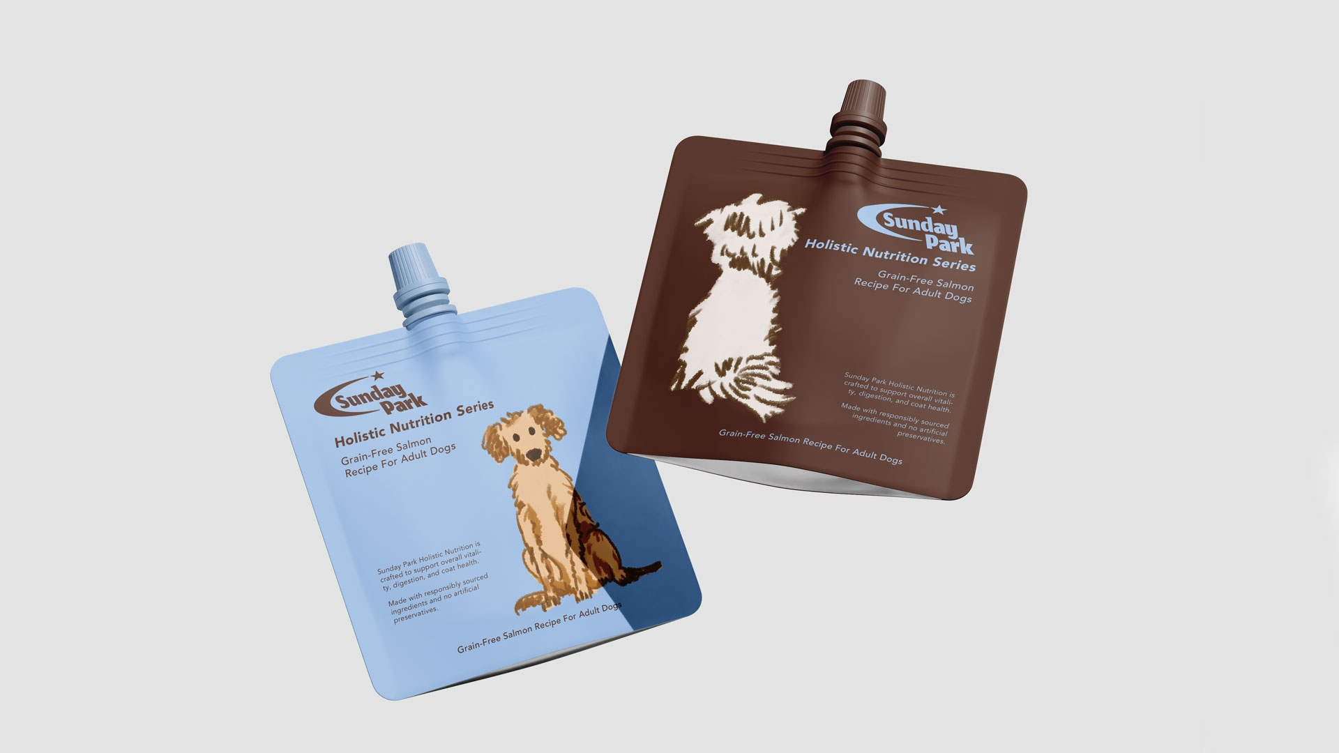
Sunday Park
Sunday Park is a contemporary pet lifestyle brand inspired by the warmth of shared weekend...

Yian Xiang is a brand designer whose work explores the intersection of strategy, visual identity, and long-term brand building. Drawing on a foundation in image-making and typography, Yian creates thoughtful identity systems that balance emotional resonance with clarity, consistency, and lasting relevance.
My name is Yian Xiang. My work sits between strategy and visual communication, with a focus on how a brand behaves over time, not only how it appears in a single moment. I first became interested in design through image-making and typography.
Over time, my focus shifted toward systems: how visual decisions scale across different formats, audiences, and contexts. That perspective naturally led me toward branding and identity design. I have also been consistently interested in the tension between emotional warmth and formal restraint.
Much of my work explores this balance, creating identities that feel approachable while remaining clear, structured, and coherent.
Sunday Park felt like the right project to share on an international platform because it reflects the kind of branding work that defines my current practice. The pet industry is often visually loud, but with this project, I was more interested in creating something quieter, more thoughtful, and built to endure.
The challenge was not to make the brand expressive for its own sake. Sunday Park already possessed a natural sense of warmth. The real challenge was developing a brand system capable of preserving that warmth consistently across different touchpoints and applications.
Winning Gold was especially meaningful because it affirmed that subtlety and restraint can be just as impactful as bold expression. Professionally, it reinforces the direction at the heart of my practice: creating brand identities that are emotionally engaging, strategically clear, and designed to stand the test of time.
Over time, I realized that what differentiates my work is not decoration, but creating brand identities that remain clear, cohesive, and adaptable across different contexts. I became increasingly interested in how visual identities function across environments, packaging, digital platforms, and physical spaces. Rather than relying on trends or visual noise, I strive to create branding that feels emotionally engaging, thoughtfully structured, and built to endure.
Restraint has become a defining part of my professional practice. Earlier in my career, I believed strong branding required more personality, more visual elements, or more overt expression. Through experience, I came to understand that clarity, consistency, and restraint can create a stronger emotional response than excess.
This project reflects that philosophy. The identity was designed to feel emotionally warm without becoming visually loud. In today’s industry, where many brands compete for attention through intensity and volume, the project represents a quieter yet highly intentional approach to differentiation.
The strength of the project came from the consistency of the brand identity. Many branding projects look compelling in presentation images but become less effective when applied across real-world touchpoints. For this project, I spent considerable time testing how the identity would perform across packaging, posters, digital assets, and environmental graphics.
The identity was never dependent on a single logo or visual device. Instead, it was built on proportion, repetition, spacing, and hierarchy. These elements gave the system flexibility while maintaining consistency and recognition.
I also believe the project benefited from a disciplined sense of restraint. It was carefully designed to include only what was necessary, allowing clarity and confidence to define the identity.
The biggest challenge was finding the right emotional balance. If the identity became too minimal, it lost its warmth. If it became too expressive, it began to feel generic within the category. The goal was to find a careful balance where the brand remained approachable while maintaining structure and clarity.
I achieved this through a series of subtle refinements rather than dramatic changes. Typography, spacing, material finishes, and color palette all played a role in shaping the final identity. Each decision was modest on its own, but together they defined the brand's overall character.
That process reinforced an important principle in my work: strong branding is often less about adding more elements and more about thoughtfully refining the relationships between them.
This recognition brings greater visibility to a branding approach centered on clarity, restraint, and long-term consistency.
I believe there is growing international appreciation for work that is thoughtful and less driven by trends. Recognition from the MUSE Creative Awards creates opportunities to connect with clients and collaborators who value enduring brand building over short-term visual impact.
Personally, my practice is focused on international and cross-disciplinary projects. I am particularly interested in work that moves between brand identity, spatial experiences, products, and digital systems rather than remaining within a single discipline. This award affirms that direction and strengthens the broader context of my work.
One response I heard repeatedly was that the project felt "very confident." I appreciated that feedback because it closely reflected the intention behind the work.
Another interesting observation was that people responded strongly to the identity even when they could not fully explain why. In branding, that is often meaningful. People may be responding to proportion, hierarchy, rhythm, and pacing rather than to more obvious visual elements.
The feedback that meant the most came from fellow designers who noticed the finer details. When people recognize the care behind the spacing, structure, and consistency, it reinforces that the identity is communicating at a deeper level.
Many designers underestimate the importance of editing. It is easy to add more references, graphics, or concepts, but strong branding often comes from knowing what to leave out. A clear identity is built through careful selection, hierarchy, and discipline.
I would also emphasize the importance of presentation. A successful project is not defined solely by its final visuals, but also by how clearly the thinking behind the work is communicated. Award submissions are most compelling when the jury can understand the challenge, the strategy, the design decisions, and how the identity performs across real-world applications. People connect with work when they can recognize the intention behind it.
The industry is evolving rapidly, particularly as AI accelerates visual production across creative fields. I believe this makes human judgment more valuable, not less.
AI can generate visuals quickly, but it cannot replace taste, critical thinking, or the ability to build a cohesive brand identity over time. As visual production becomes faster and more accessible, thoughtful decision-making and creative direction become even more important.
Looking ahead, my focus remains on creating branding systems that are culturally aware, visually disciplined, and adaptable across a wide range of environments.
I believe designers should participate once they have a project they can confidently articulate.
Competitions are valuable because they encourage designers to look beyond the final visuals and examine the thinking behind their work. Preparing a submission helps clarify the strategy, execution, and relevance of a project. That process is worthwhile regardless of the outcome.
Confidence comes from continuously creating, refining your perspective, and learning how to communicate design decisions with clarity. Award submissions provide an opportunity to place your work within a broader professional context while challenging you to consider how it resonates beyond its immediate audience.
Some of the most interesting work happens when designers remain curious beyond their own discipline.
Today, branding intersects with architecture, fashion, publishing, technology, product design, and cultural research more than ever before. As the boundaries between these fields continue to blur, they create new opportunities for collaboration and innovation.
I also believe there is value in slowing down. Not every brand needs to compete for attention at maximum volume. Often, the most enduring work comes from clarity, restraint, and a deeper understanding of how people experience a brand over time.
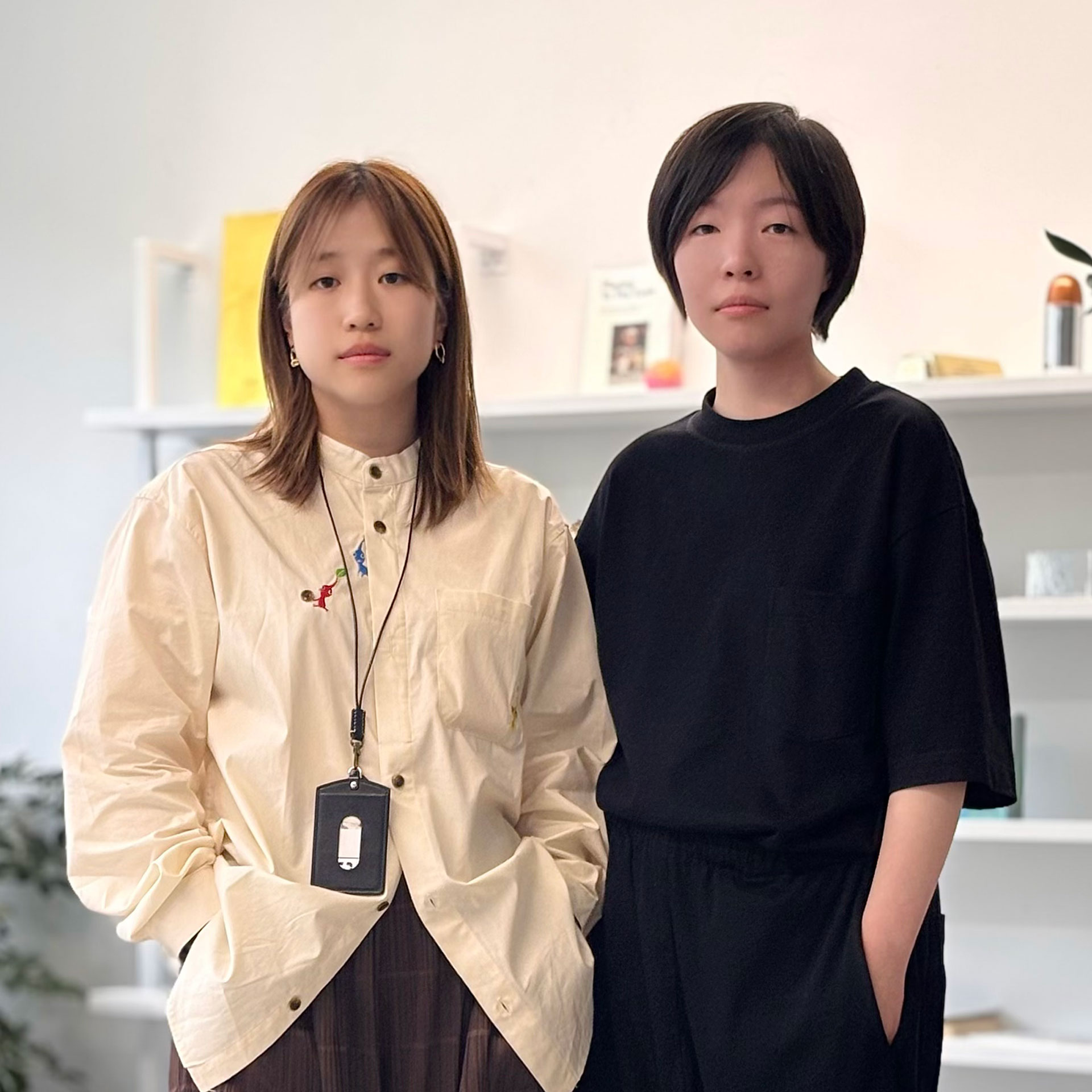
Definitely our team. Projects like this are the result of ongoing collaboration, discussion, testing, and refinement. Strong brand identities are rarely created by one person alone—they emerge through shared ideas, thoughtful feedback, and careful attention to detail. I am especially grateful to everyone who challenged the work and helped make it stronger at every stage.
This achievement belongs to that collective effort. It reflects the dedication, patience, and craftsmanship that everyone brought to the project.
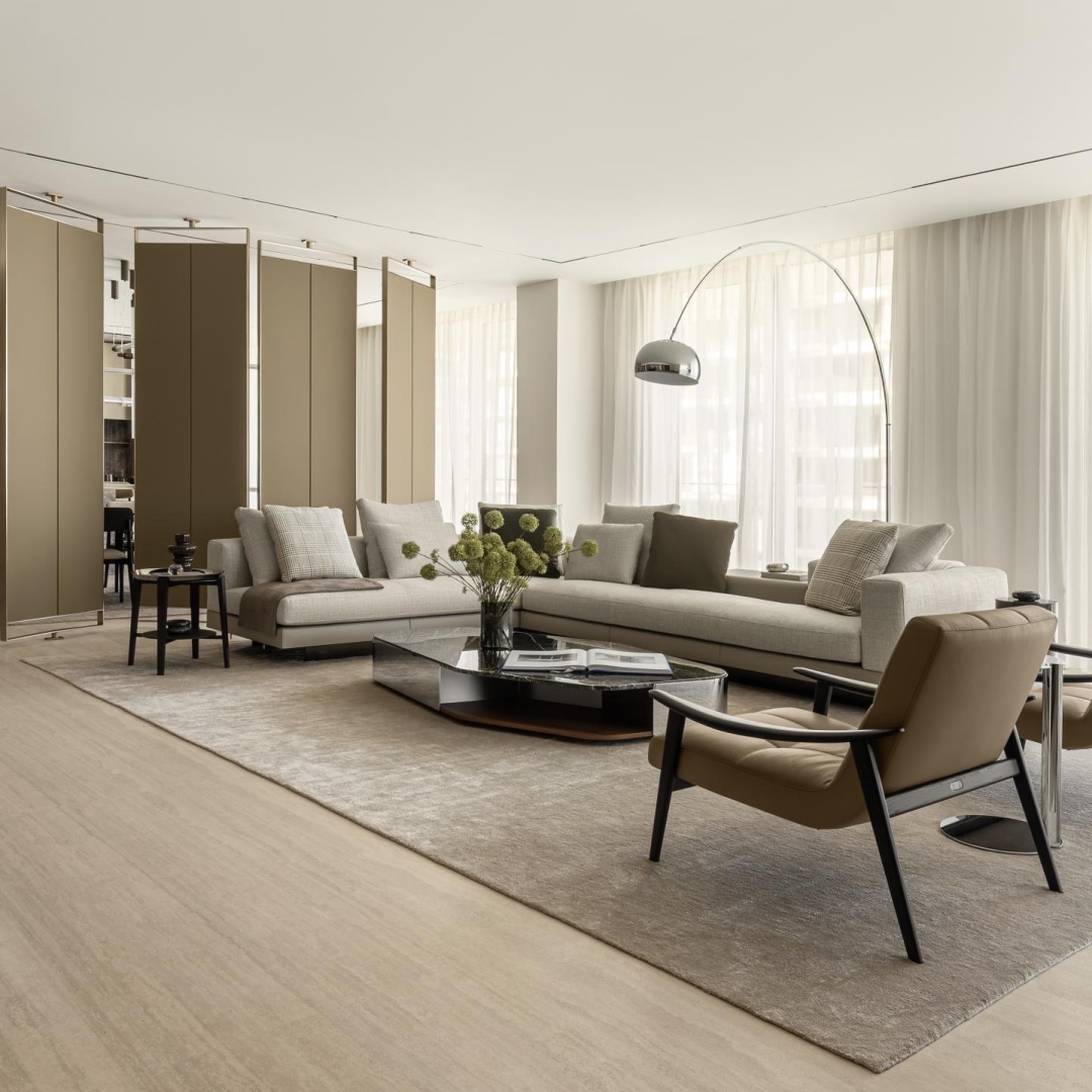
This project is a contemporary brand identity system designed to bring clarity, warmth, and long-term consistency to the evolving pet lifestyle industry.
That description captures the two defining qualities of the project: emotional warmth and structural discipline. The identity was created not only to be visually engaging, but also to function as a cohesive and adaptable system across a wide range of applications.
Right now, my practice is centered on international branding and cross-cultural brand identity systems.
I am focused on creating work that moves seamlessly between physical and digital environments while maintaining a strong conceptual foundation. I am also increasingly interested in how brand identity extends beyond traditional graphic design to shape spaces, products, and user experiences.
Across all of these directions, I remain committed to creating work that is thoughtful, enduring, and structurally clear.