
B Beworths Radiates Natural Vitality Through Packaging Design
NOVEMBER 10, 2026
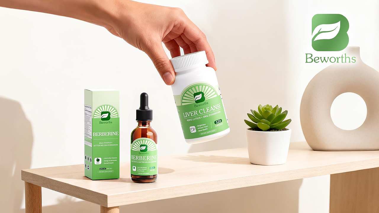
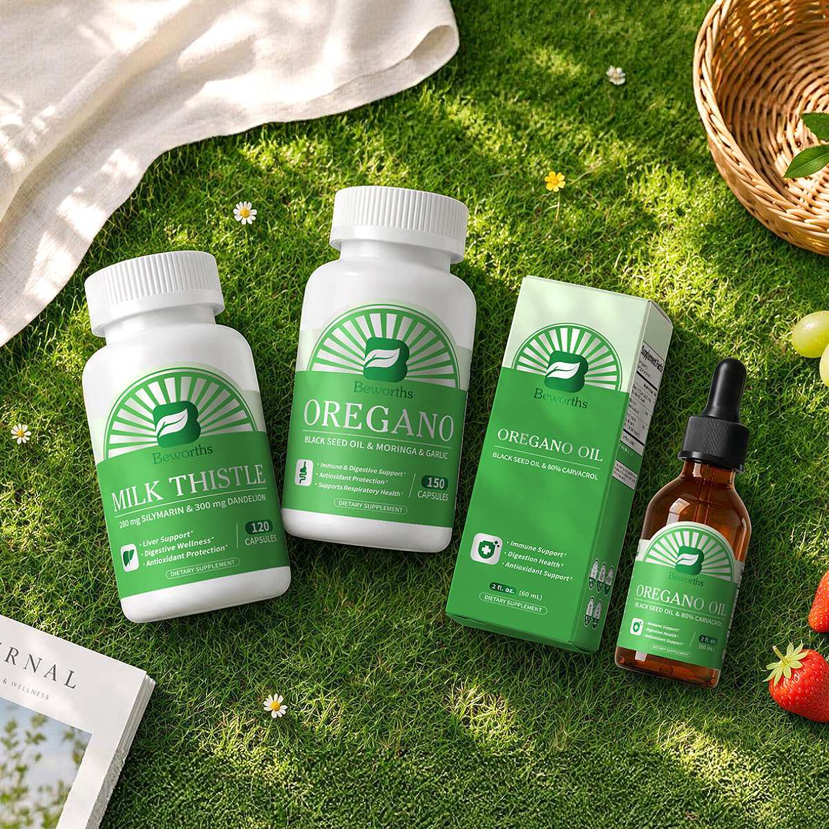
B Beworths, developed by Minch Global Trade Inc., presents a packaging series inspired by the concept of "Natural Radiance, Gathered Energy." Drawing from the warmth of sunlight and the vitality of nature, the design uses outward-radiating halo graphics to create a distinctive visual identity centered on the brand logo.
Regularly arranged radial lines extend from the logo in layered formations, creating the impression of sunlight spreading outward. This visual approach symbolizes the diffusion of nutritional ingredients throughout the body, reflecting the brand's focus on supporting physical vitality and overall well-being.
The integration of natural imagery and brand elements gives the packaging a cohesive visual language. Its radiant graphics communicate warmth, energy, and a positive approach to healthy living, while reinforcing brand recognition across the product series.
Through its thoughtful use of symbolism, graphic composition, and brand identity, B Beworths translates its health and wellness philosophy into a distinctive packaging experience. The series has been recognized as a winner in the Packaging Design – Health & Wellness category at the 2026 MUSE Design Awards, celebrating Minch Global Trade Inc.'s achievement in bringing nature-inspired creativity to health product packaging.
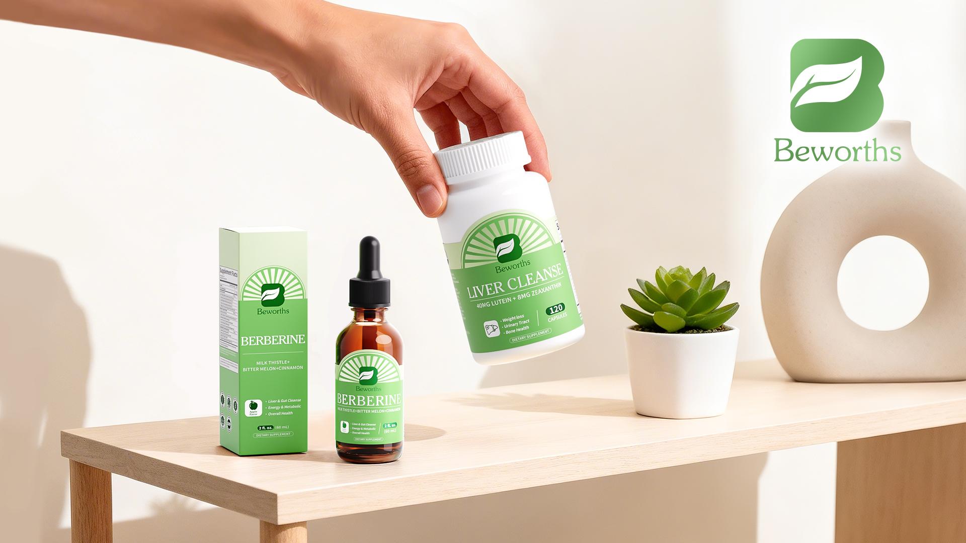
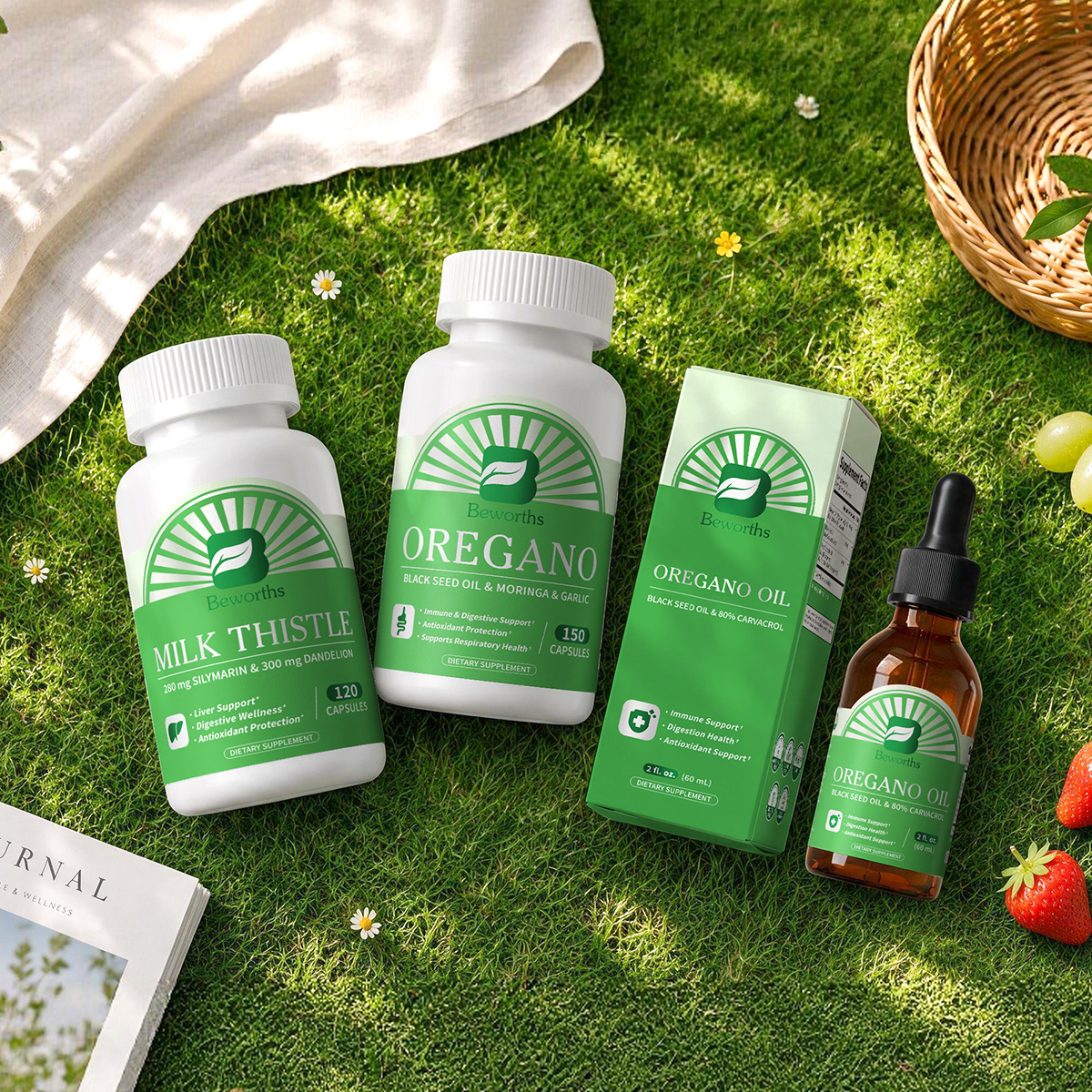


Entry Title: B Beworths
Entrant Name: Minch Global Trade Inc.
Winning Category: Packaging Design - Health & Wellness
Explore how MoMo.Co.,Ltd. transforms the dining experience at Sushi Tei Jawa through thoughtful interior design in this article.