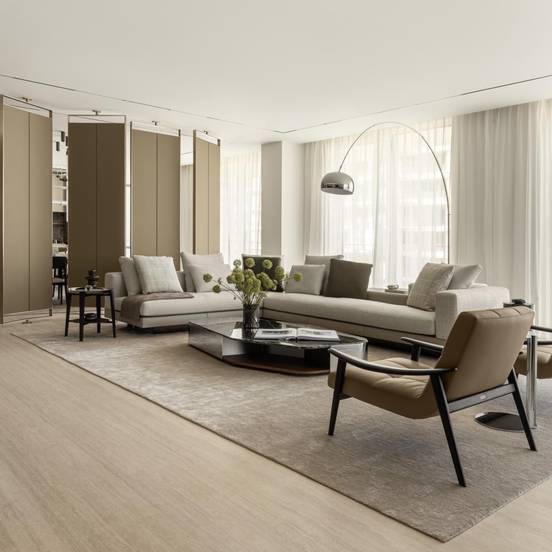
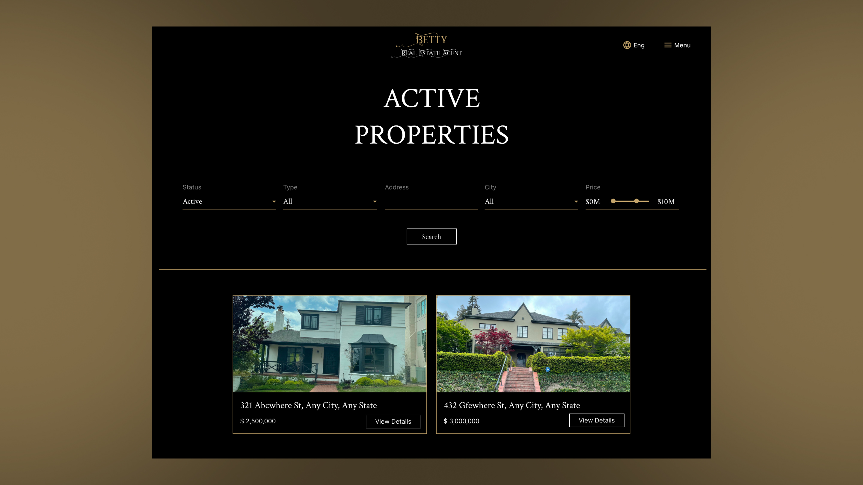
SparksGlo Real Estate Agent Wordpress Website Template
The SparksGlo Real Estate Agent WordPress Website Template is a CMS-based website solution specifically designed...

Danting Li is a senior graphic designer and co-founder of SparksGlo LLC, working across branding, packaging, typography, and digital design. Her practice focuses on translating cultural narratives into contemporary visual systems, often combining traditional aesthetics with modern product experiences.
I am a senior graphic designer and co-founder of SparksGlo LLC, currently based in the San Francisco Bay Area. My work spans branding, packaging, typography, web design, and visual systems, with a focus on translating cultural narratives into contemporary design. I am particularly interested in combining traditional visual language with modern product experiences.
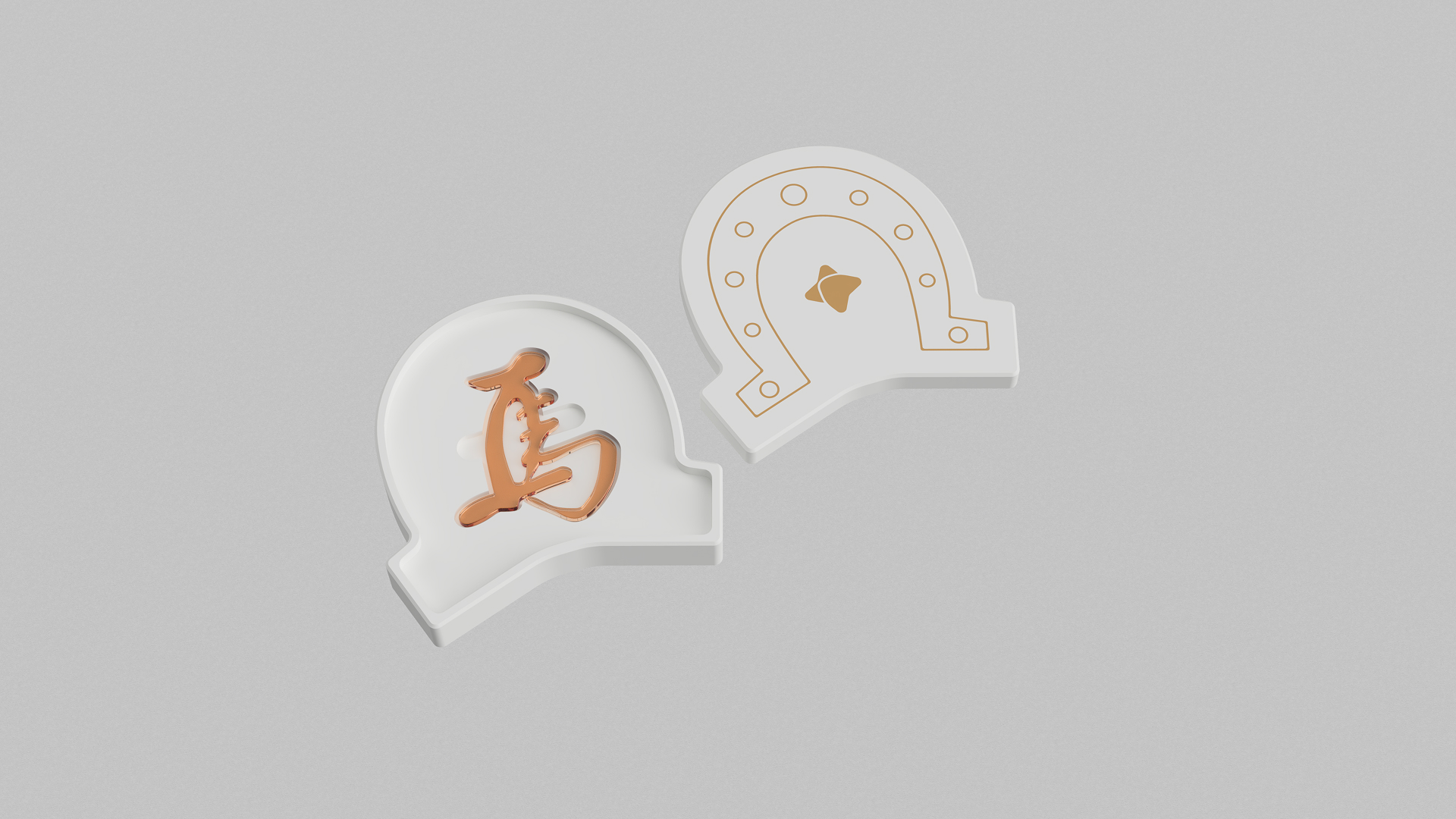
Many of my projects explore how typography, structure, and material can communicate cultural meaning. The SparksGlo Horse Sugar Script Blind Box continues this direction by merging calligraphy, heritage craft, and collectible packaging into a cohesive design system, while the SparksGlo Real Estate Agent WordPress Website Template focuses on clarity, modular layout, and usability for digital product experiences.
To date, I have received more than 20 international design awards across multiple projects. These recognitions reflect both strong design execution and my interest in transforming ideas into engaging product experiences.
This recognition is meaningful because the award focuses on product thinking and design execution. Both of my winning projects explore different directions. One is a cultural packaging design. The other is a digital website template designed for usability and clarity. Being recognized for both demonstrates the versatility of my approach. It also confirms that strong concepts and thoughtful structure can work across both physical and digital products.
The award strengthened SparksGlo’s positioning in product oriented design. It helped showcase our ability to design both physical packaging and digital templates. It also opened conversations with clients interested in cultural products and website templates. The recognition increased visibility and made it easier to introduce original concepts during early discussions.
Experimentation is central to my process. I often test form, structure, and interaction before finalizing visuals. For the Horse Sugar Script Blind Box, I explored different geometric interpretations of a horseshoe. I tested stacking behavior and internal tray shapes. This experimentation led to the palace tile stacking concept. For the real estate WordPress template, I experimented with modular layout blocks. This allowed agents to quickly adapt pages while maintaining visual consistency.
The stacked roof tiles of ancient Chinese architecture inspired the packaging structure of the Horse Sugar Script Blind Box. I translated that architectural rhythm into a packaging system. When multiple boxes are stacked, they resemble glazed roof tiles. This created a cultural reference using only form and repetition.
Design is not only about visuals. Structure, usability, and interaction are equally important. Many decisions happen before the final look. Research, proportion, and user behavior shape the outcome. A clean result usually comes from careful planning rather than decoration.
I focus on shared goals. I present concepts with clear reasoning and show how they support the brief. When clients understand the logic, alignment becomes easier. I also keep flexibility in execution while protecting the core concept. This balance helps maintain both clarity and collaboration.
For the Horse Sugar Script Blind Box, the challenge was designing eleven different internal structures. Each script has a unique silhouette. I created custom trays that match each shape while keeping the outer box identical. For the real estate template, the challenge was creating a website template suitable for most real estate agents. I addressed this through user research and usability testing to define the best design solution, then designed and implemented it to resolve the challenge.
I step away from the screen and look at physical references. Museums, packaging, typography books, and architecture often help reset my perspective. I also sketch simple forms. This usually helps me return to the core idea.
I value clarity, cultural respect, and thoughtful structure. Many of my projects connect traditional culture with modern design language. I also focus on creating designs that people can interact with. Form, opening experience, and layout all contribute to meaning.
Focus on concept first. A strong idea supports everything else. Study typography, proportion, and layout fundamentals. Also build projects that show your thinking, not just visuals. Consistency and clarity matter more than trends.
I would choose Viktoria Shao. Her work shows clarity, structure, strong hierarchy, and refined aesthetics. I appreciate her systematic approach, disciplined use of form, and strong sense of design aesthetics combined with front end development skills. Collaborating with her would be an opportunity to explore minimal yet meaningful, effective, and cost effective design solutions.
I wish people would ask if there are any artworks or projects I plan to launch in the future. My answer would be that, besides already launched award-winning projects such as the SparksGlo Horse Sugar Script Blind Box, SparksGlo Real Estate Agent WordPress Website Template, and Venus Jewelry E-commerce Website Design.
I will launch new design projects including Conditional Privacy, which explores the illusion of data privacy in contemporary digital systems; SparksGlo Artack Regular Type Design, a sans serif typeface designed for clean, artistic, and contemporary brand applications such as visual poetry, posters, web banners, packaging, and more.
SparksGlo Magazine Design, which will showcase and compile exceptional artworks from talented designers worldwide; and SparksGlo Rebranding & Marketing Design, which aims to refresh and modernize SparksGlo’s visual identity.
Explore this link to read design insights on Rethinking How Tutors Interact With AI Systems, Through Boyuan Guo’s Lens.