Archer Packaging Redesign
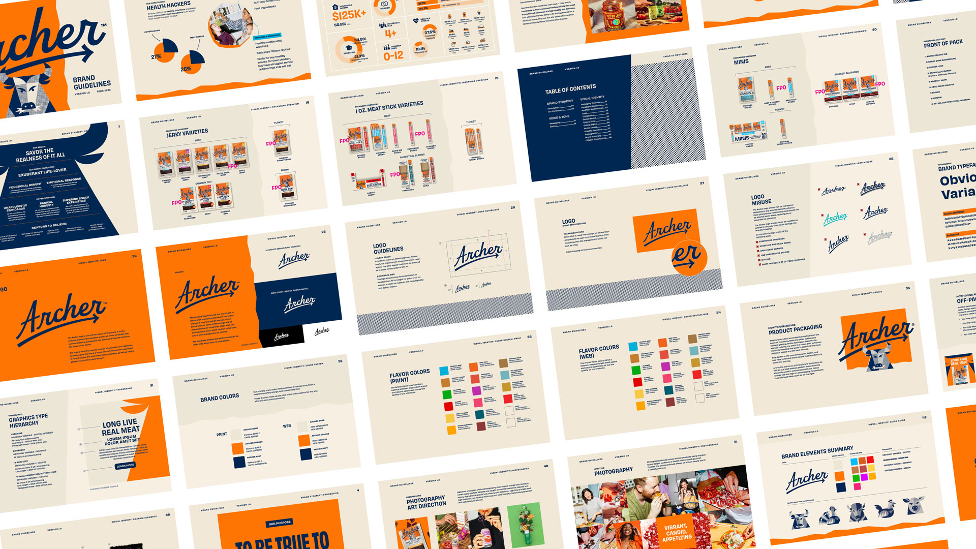
Archer set out to break free from a visually interchangeable jerky category dominated by dark...
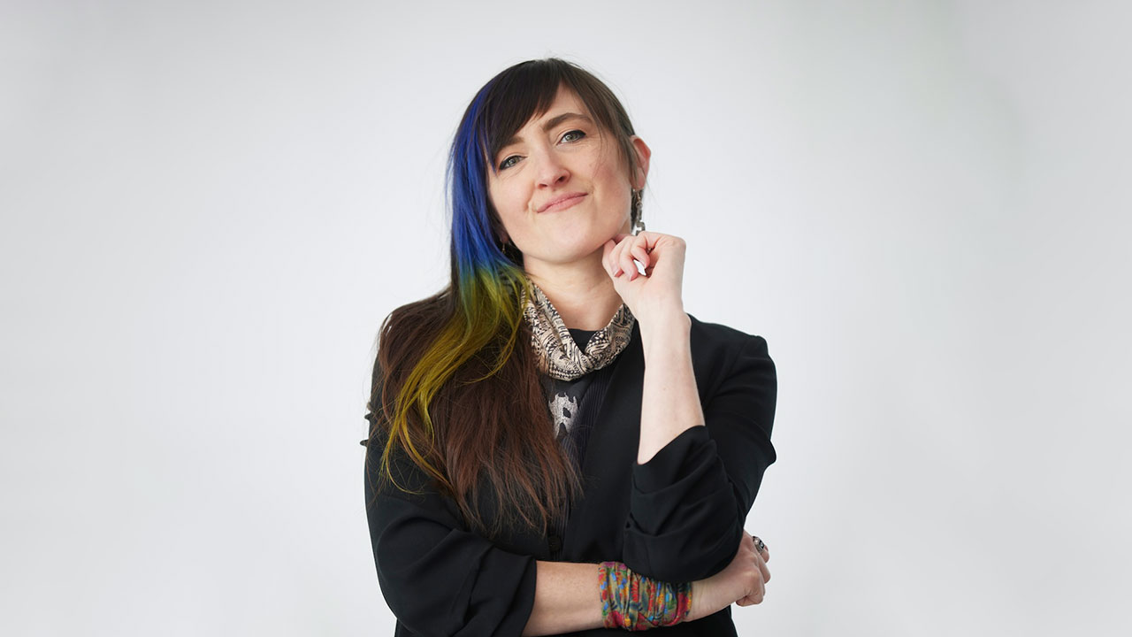
Kat Tushim is Executive Creative Director at Amp Agency, where she leads the creation of consumer-first brand identities, packaging, and experiential campaigns, combining strategic storytelling with refined craftsmanship to deliver culturally resonant design.
My name is Kat Tushim, and I am an ECD at Amp Agency. We are a full-service marketing agency that brings together a collection of specialized disciplines to create consumer-first, high-impact work. Our expertise spans identity, packaging, fully integrated campaigns, content creation, social activations, and experiential events.
My background is a holistic blend of these disciplines, but in recent years, my focus has been on brand and experiential design. My eye is always directed toward the craft, pushing for designs that feel both familiar and fresh, along with strategic storytelling solutions that are culturally resonant.
We don't need recognition to know we work with a great team, but peer and industry recognition keeps us honest about the work we produce and motivates us to continually strive for better.
It's not simply hardware on a shelf; it's recognition for pushing design forward and creating work that makes meaningful connections.
Aside from all the research, strategy, and craft that go into identity and packaging, it's often in the pursuit of distinction that we find success. By pushing beyond category conventions and designing for a more discerning, premium-minded consumer, we explored a brighter, more energetic color palette, a sophisticated and modern bull icon, and clear, uncomplicated claims that would stand out in a dark, highly textured, and visually crowded jerky aisle.
It worked because distinction matters when consumers are scanning, comparing, and filtering through hundreds of options. It also helps that the growing demand for protein-rich diets positions Archer to meet the needs of an expanding market.
Honestly, it was a bit of a perfect storm: we had a jerky category dominated by highly masculine packaging, rising demand for high-protein foods from a broader audience than just men, and a great product. When creating brand identities and packaging, we know the real key is creating distinction, and there was a clear opportunity to reposition the brand so it would stand apart while appealing to this new audience.
By speaking to an audience that isn't typically addressed in this category, we made decisions that set the brand apart from the competition. We stopped thinking about the brand as jerky and instead positioned it as a better-for-you snack. This led us to make intentional choices in color, typography, illustration, and even to drop "Country" from the original name, moving away from the expected meat-snack category in favor of the simpler, more modern Archer.
There is an intangible aspect of design that relies as much on intuition and taste as it does on research and strategy. One of the biggest challenges is deciding which elements of a brand's equity to preserve and which to leave behind during a refresh.
For Archer, it took time to fine-tune the brand's legacy elements while building a better-for-you snack aesthetic without losing its connection to the category. The best way to overcome design challenges like this is through exploration—to experiment, push boundaries, and refine until the balance feels right. That's exactly what we did.
We tested subtle adjustments, such as adding a curve to one edge but not another, and swapped typefaces until we found the right balance of modernity and accessibility. From there, we validated those decisions through testing and focus groups.
We're seeing a lot of traction for this brand in the news, and having traveled quite a bit lately, we're delighted to see Archer in airports across the country. It's always exciting to see the work come to life in that way.
This is the kind of work that gets us out of bed in the morning: building brands, scrutinizing the psychology behind every curve and color choice, and ultimately creating something that people love and make part of their everyday lives. I look forward to working with more great clients and bringing more projects like this to life.
All around, it has been very positive. We've already met many new clients and designers because of this work, which is probably the best compliment you can receive.
Don't be afraid to explore the areas you once promised not to touch. Sometimes they end up being the key to uncovering the real problem you're trying to solve.
There is an ever-growing need for speed, and I appreciate the ease these technological shifts have brought us over the last several years. Tasks that once took hours or days can now be completed in minutes. This gives us more time to focus on the areas AI can't replace, such as taste, craft, and the bold connections that only human creativity can bring to life.
As content becomes increasingly abundant, good taste and IRL experiences become even more valuable, which is why I see identity and experiential design as critical differentiators. Markets are saturated with competitors that are often on par in terms of pricing or technology, and design is where brands can build reputations, earn trust, and create cultural relevance.
Sometimes the best way to learn is by doing. A great place to start is by reviewing past winners and entries to understand what makes them successful while developing your own style, refining your eye, and identifying the awards that best fit your work.
Community starts with you. If you don't see it out there, start it yourself.
If you live in Chicago, check out True Chicago, the nonprofit creative community where I serve on the board. Our mission is to support the next generation of creatives by connecting emerging talent with leaders across industries, creating more opportunities for inspiration, collaboration, and mentorship. Attend a social event, join a workshop, have your portfolio reviewed, and make a new creative connection.
It's as you said—it truly is a group effort. I'd refer anyone back to the entry, which I believe includes the names of all the contributors, but I'd like to give special shout-outs to our client, who embraced the strategy and vision from the very beginning, making the process both rewarding and collaborative.
I'd also like to recognize our key designers, who never settle for "good enough"; our writers, who find joy in capturing a brand's character in just a few words for the packaging; and our strategists and account leads, who immerse themselves in the industry and collaborate to build a strong foundation for every project.
Lighten up the jerky aisle by redefining Archer as a better-for-you snack.
Why? Because it's not simply a package redesign—it's a brand repositioning that drives every design choice, from the renaming to the messaging, at the core of the work.
Our design practice never stands still, and we're continuing to build on our success by expanding our expertise in identity, packaging, and experiential design.
We have several CPG products that will be on physical and virtual shelves by the end of this year. If you're in New York for soccer this July, stop by our Tylenol experiential event to cool off and connect with the game.