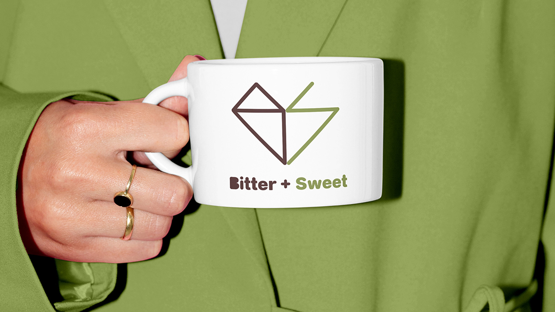
Bitter + Sweet Logo Design
The visual identity for Bitter + Sweet is built on the "double-read" principle and the...

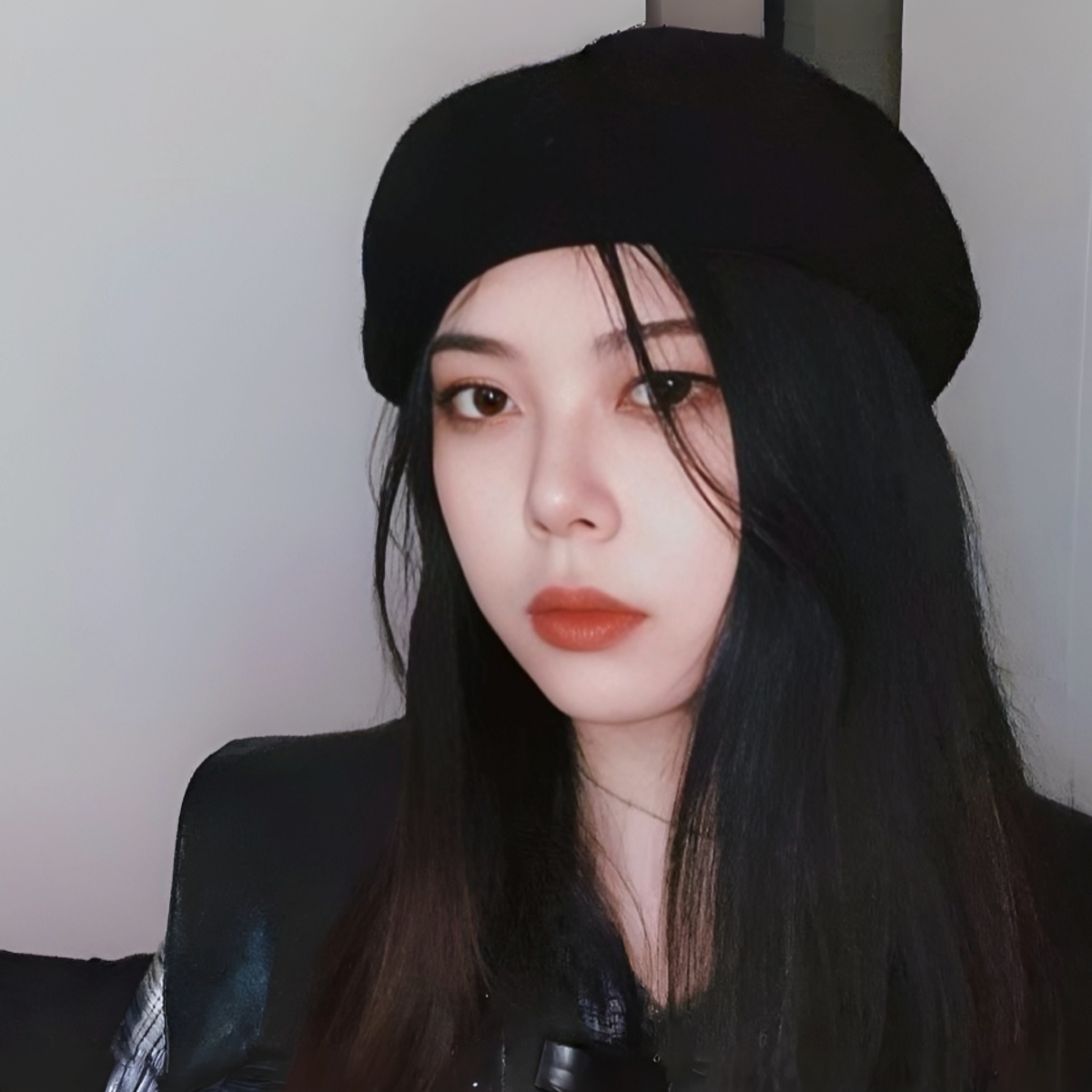
Liying Wang is an interdisciplinary designer who blends fine arts with visual communication to create impactful brand experiences. As she moves into tech, she reimagines digital products as narrative-driven environments.
I am an interdisciplinary designer with a foundation in theatre, film, and TV fine arts, further developed in graphic design and digital media. My journey began with a fascination for how physical environments tell a story—a perspective I first brought into the digital marketing industry. In that space, I learned how to use visual resonance to capture attention and build brand identity.
I am currently transitioning my practice into the tech industry, driven by a desire to solve more complex, systemic problems. While marketing taught me how to communicate a message, tech is teaching me how to build a world. I see digital products as the modern “stage,” where every pixel must serve both the narrative and the user’s needs.
My core philosophy is that visual appeal and technical functionality are not trade-offs—they are partners. Visual appeal is the “hook” that builds emotional trust and invites the user in, while functionality is the “performance” that delivers on the brand’s promise.
I submitted Bitter + Sweet because it represents a shift in my practice toward lifestyle and hospitality branding.
Winning at the MUSE Creative Awards validates the idea that high-level craft and simple, human emotions—like the love of a good cup of coffee—can coexist within a single design. It also serves as a reminder of my passion for design and storytelling, marking my growth through both work and study.
The project was inspired by the intrinsic duality of the coffee experience—the balance between the intense bitterness of a dark roast and the subtle sweetness of a high-quality bean. In coffee, bitterness and sweetness are not opposites, but partners.
I wanted to move away from the cold, industrial “tech coffee” aesthetic common today and create something that feels both precise and emotionally warm. It reflects a harmony of opposites that defines the craft coffee experience.
The key differentiator is the idea of a “hidden narrative.” While most coffee brands rely on literal tropes like beans or steam, this project uses a strict mathematical grid to construct a minimalist monogram that feels discovered rather than designed.
By embedding the “B” and “S” within the heart, I created a subtle “Easter egg” that rewards attention. This hidden layer invites deeper engagement, fostering a stronger connection than a conventional icon ever could.
The biggest challenge was balancing the sharp geometry of the monogram with a warm, human feel. Because the logo is built on a strict mathematical grid, it risked appearing too rigid.
I addressed this by introducing an organic color palette—espresso brown and sage green—and pairing the icon with a rounded, approachable typeface. This ensured the brand felt handcrafted rather than machine-made.
For me, this award validates my “Stage-to-Brand” methodology, proving that my background in theatre and fine arts is not just a pivot, but a strength that allows me to build immersive brand worlds. It positions me as a designer who values narrative depth over passing aesthetic trends.
I’ve already noticed a shift in how I present my ideas to stakeholders. This recognition serves as a seal of approval, giving decision-makers greater confidence in more experimental directions.
The most memorable feedback often comes from that “aha” moment. At first, people respond to the warmth of the heart, but once they notice the hidden “B” and “S” within the geometry, their reaction shifts—there’s a sense of discovery.
Audiences have described it as “rewarding design,” something that makes them feel like they’re part of a subtle, shared insight. That level of engagement goes far beyond what a standard, literal coffee icon can achieve.
Don’t stop at the first good idea—keep exploring. Every design choice should have a clear purpose. If you use a specific color or grid, be able to justify it through the lens of the brand’s story. In my case, sage green wasn’t just a trend; it was a nod to the “sweet” side of the concept and the inclusion of tea in the shop’s craft.
Show your work in real-world contexts. A logo on a white screen is just a drawing; a logo on a canvas tote bag or a barista’s apron becomes a brand experience.
I see a shift toward intentional minimalism. In an era of visual noise, brands don’t need to shout—they need to mean something. I aim to position myself at the intersection of visual clarity, analytical thinking, and structured problem-solving, bridging high-level strategy with soulful storytelling.
Whether it’s a digital interface or a physical space, my goal is to create work that feels inevitable—as if it was always meant to exist.
Think of awards not as a ranking, but as a conversation. Entering Bitter + Sweet was my way of asking the global design community, “Does this story resonate?”
Even if you don’t win, the process of articulating your intent and approach pushes you to become a stronger communicator of your own value. Your work deserves to be seen beyond your hard drive or workplace.
My message is simple: don’t limit your inspiration to your own industry. To move the needle in design and marketing, we need to break out of our creative silos and collaborate in telling more meaningful stories.
While the execution of Bitter + Sweet was a solo endeavor, its creative foundation was shaped by a “virtual team” of influences. I would like to dedicate this award to my mentors and colleagues from the theatre and design world, who first taught me that design isn’t just about making things look “pretty”—it’s about building a world where a story can unfold.
“A geometric exploration of harmony between opposites, using a hidden monogram to celebrate the duality of the craft coffee ritual.”
From my perspective, this project serves as a proof of concept that technical precision—the grid—and human warmth—the heart—are not mutually exclusive. It reflects my belief that the most powerful brands are those that embrace and unify their inherent dualities.
I am currently preparing for several projects in 2026, with a focus on advancing my practice in visual communication design. Feel free to reach out if you’d like to learn more—I’d be happy to connect and share.